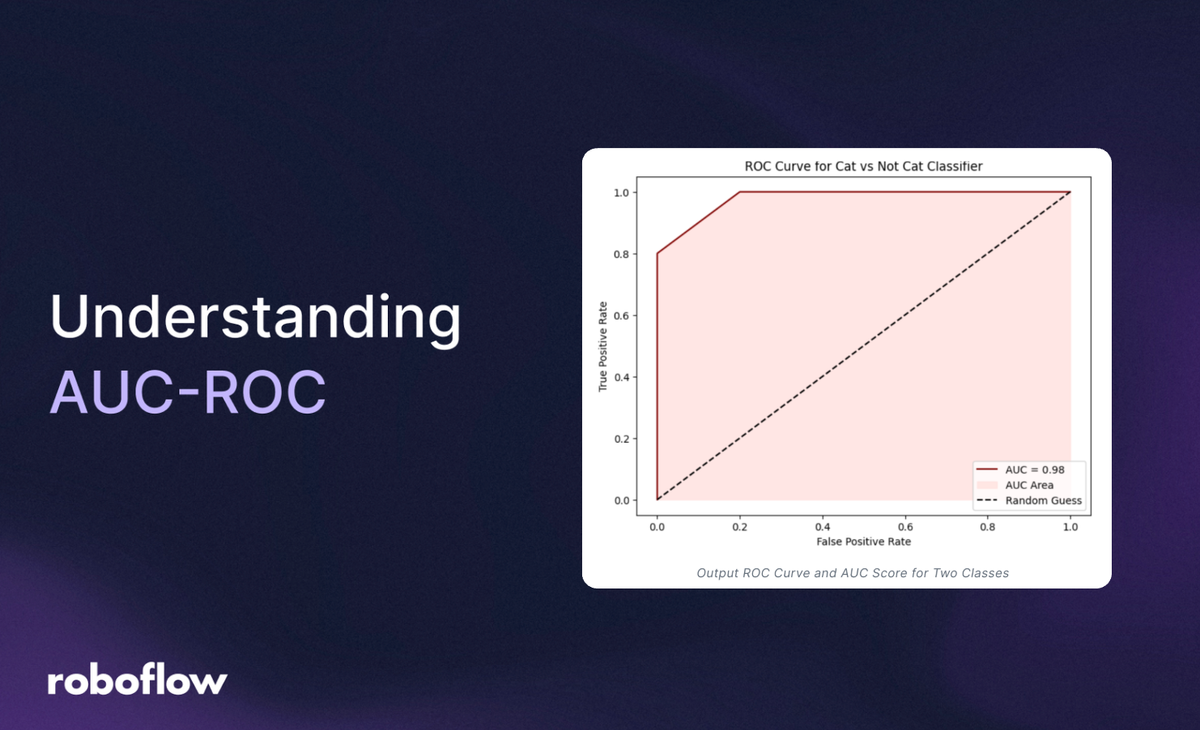
AUC-ROC stands for Area Under the Receiver Operating Characteristic Curve. It is a metric used to evaluate the performance of binary classification models. Think of it as a way to measure how well a model distinguishes between two classes, like "cat" vs. "not cat" or "spam" vs. "not spam." Although this method works only for binary classification problems, it can also be extended to evaluate multi-class classification issues.
The key terms used in calculating AUC-ROC score are the following:
- ROC Curve (Receiver Operating Characteristic Curve)
- AUC (Area Under the Curve)
ROC Curve
What is ROC Curve?
ROC stands for Receiver Operating Characteristic curve. It is a graphical tool used to evaluate the performance of a binary classifier. It is used to visualize how well your model separates two classes, like "positive" (e.g., "cat") vs. "negative" (e.g., "not cat"). The ROC curve plots two key metrics against each other across different decision thresholds. To make this curve, we calculate:
True Positive Rate (TPR): It is the fraction of actual positives correctly identified. In other words, TPR is the proportion of actual positives that were correctly predicted as positive.

Where,
- TP = True Positives (correctly predicted positives) meaning model predicted positive, and it is positive.
- FN = False Negatives (positives missed) meaning model predicted negative, but it is positive.
For example suppose if there are 100 actual positive cases (e.g., images of cats), and your model correctly identifies 80 of them as positive then TPR is:

False Positive Rate (FPR): It is the fraction of negatives incorrectly classified as positives. In other words FPR is the proportion of actual negatives that were incorrectly predicted as positive.

Where,
- FP = False Positives (negatives wrongly labeled positive) meaning model predicted positive, but it is negative.
- TN = True Negatives (correctly predicted negatives) meaning model predicted negative, and it is negative.
For example, suppose if there are 100 actual negative cases (e.g., not-cat images), and your model mistakenly marks 30 of them as cat then FPR is:

The ROC curve plots True Positive Rate (TPR) against False Positive Rate (FPR) for every possible threshold value between 0 and 1. Several threshold values (not all, but enough to show the overall pattern) are used to plot TPR against FPR on the ROC curve. A threshold is the cut-off point that turns a predicted probability into a class label (like positive or negative).
If predicted probability >= threshold# predict positive class (Cat)If predicted probability < threshold # predict negative class (Not Cat)
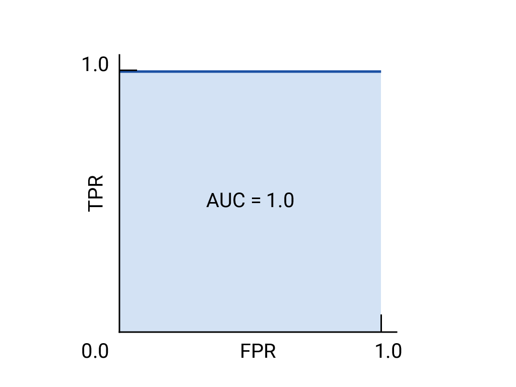
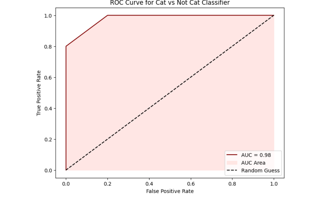
A perfect model would reach the top-left corner of the graph at point (0, 1), meaning it never makes a false positive (FPR = 0) and always makes a correct positive (TPR = 1).
How ROC Works?
Imagine you have a model that tells you whether an image contains a cat. Instead of simply saying “yes” or “no,” it gives a probability score between 0 and 1. You then choose a threshold to decide what counts as a “cat” image. For example, if you set the threshold at 0.5, any image with a score above 0.5 is predicted to have a cat, and anything below is not.
Now, think about what happens when you change that threshold:
- When you take high threshold (like 0.9), only images with very high scores are classified as having a cat. This means you're very cautious and likely have few false alarms (low False Positive Rate), but you might miss many actual cat images (low True Positive Rate).
- When you take a low threshold (like 0.1), almost every image is classified as having a cat. You catch nearly all cat images (high True Positive Rate), but you also wrongly classify many images without cats (high False Positive Rate).
The ROC curve is a graph that shows this trade-off. It plots the True Positive Rate (how many actual cats you correctly identified) on the y-axis against the False Positive Rate (how many non-cat images you mistakenly labeled as cats) on the x-axis as you slide the threshold from 1 (very strict) down to 0 (very lenient).
Starting at (0,0), with an extremely high threshold, you predict no images as cats, so both rates are 0. Ending at (1,1), with an extremely low threshold, you predict every image as a cat, so both rates are 1.
A perfect classifier would reach the top-left corner (True Positive Rate of 1 and False Positive Rate of 0) because it catches all cats without any false alarms. In contrast, a model that’s just guessing randomly would create a diagonal line from (0,0) to (1,1).
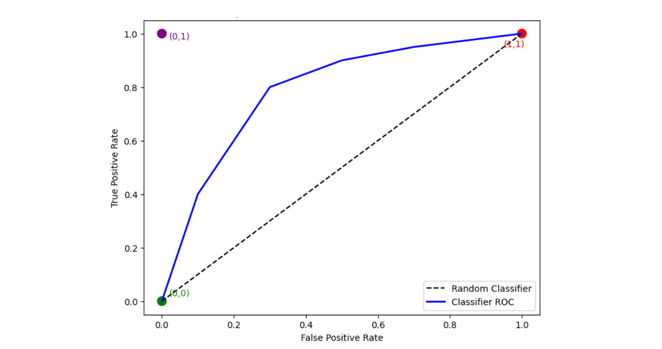
The ROC curve helps you see how well your classifier is performing across all possible thresholds by balancing the trade-off between catching true cats and avoiding false alarms.
What Is AUC?
AUC stands for Area Under the Curve, here the area under the ROC curve. It provides a single numerical value that summarizes how well the classifier can distinguish between the positive class (cat images) and the negative class (non-cat images). AUC ranges from 0 to 1 where if:
- AUC = 1: The classifier is perfect, which means it ranks all cat images higher than all non-cat images.
- AUC = 0.5: The classifier performs no better than random guessing; its ROC curve follows the diagonal line.
- AUC < 0.5: This indicates that the classifier is performing worse than random. In fact, if you were to invert the class predictions (swap labels), the AUC would be above 0.5.
AUC measures the probability that a randomly selected image containing a cat will have a higher prediction score than a randomly selected image without a cat. This means it assesses the model’s overall ranking ability, regardless of the chosen threshold. AUC is useful because,
- AUC does not depend on a specific threshold. This is valuable because choosing a threshold can be arbitrary and might vary depending on the problem.
- It allows you to compare different classifiers regardless of the decision threshold. A higher AUC indicates a better-performing model in distinguishing between the two classes.
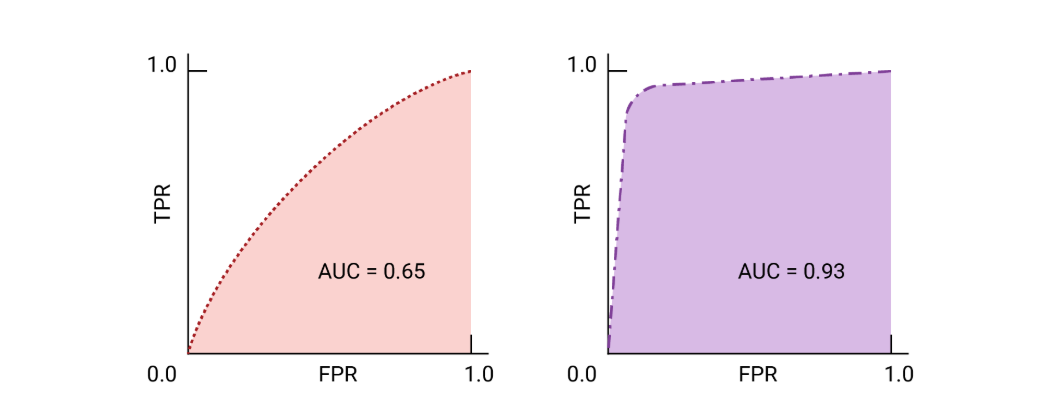
- Since it aggregates performance across all thresholds, AUC gives a comprehensive measure of the model’s ability to differentiate between positive and negative cases.
AUC is a powerful metric because it combines the entire ROC curve into one number, reflecting the probability that the classifier will correctly rank a randomly chosen positive instance higher than a randomly chosen negative one. This makes it an excellent tool for evaluating the overall quality of ML model.
Example of AUC ROC in Computer Vision
AUC ROC can be used in computer vision to evaluate the performance of image classification models. In this section we will explore how AUC ROC can be used for both binary image classification and multi-class image classification.
roc_curve function of sklearn library computes the ROC curve points, which are pairs of True Positive Rate (TPR) and False Positive Rate (FPR) for various threshold values.roc_auc_score function of sklearn library computes the Area Under the ROC Curve (AUC), providing a single scalar value to summarize the model's performance across all classification thresholds.The following libraries are required for the examples given here.
import numpy as np
import matplotlib.pyplot as plt
from sklearn.metrics import roc_curve, auc
Example #1: Binary Image Classification
Imagine you have a dataset for image classification model to identify whether there is a “cat” in image or “not cat”.
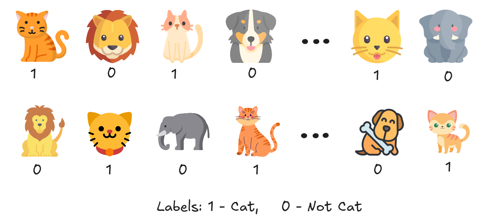
Step #1: Get Ground Truth and Prediction Probabilities
Suppose we have an image classification model that provides predictions stored in y_scores, and we also have the ground truth labels for the same 20 images corresponding to these predictions.
# Predicted probabilities - more overlap to make ROC curve rounder
y_scores = [0.7, 0.6, 0.65, 0.4, 0.75, 0.35, 0.6, 0.45, 0.7, 0.3,
            0.5, 0.6, 0.4, 0.65, 0.55, 0.7, 0.25, 0.8, 0.6, 0.75]

# Ground truth labels (1 = Cat, 0 = Not Cat)
y_true = [1, 0, 1, 0, 1, 0, 1, 0, 1, 0,
          0, 1, 0, 1, 0, 1, 0, 1, 0, 1]
Step #2: Calculate ROC Curve
We compute TPR and FPR at different thresholds using scikit-learn.
fpr, tpr, thresholds = roc_curve(y_true, y_scores)
Step #3: Calculate AUC
Now we compute the area under the ROC curve.
auc_score = auc(fpr, tpr)
print(f"AUC Score: {auc_score:.4f}")
Or, you can also use:
auc_score = roc_auc_score(y_true, y_scores)
Step #4: Plot ROC Curve
Finally plot the ROC Curve and AUC Score.
plt.plot(fpr, tpr, label=f"AUC = {auc_score:.2f}")
plt.plot([0, 1], [0, 1], 'k--', label='Random Guess')
plt.xlabel("False Positive Rate")
plt.ylabel("True Positive Rate")
plt.title("ROC Curve for Cat vs Not Cat Classifier")
plt.legend()
plt.grid(True)
plt.show()
You should see the following output.
Example #2: Multi-Class Image Classification
The AUC of the ROC is a widely used metric for evaluating binary classification models. However, with some adaptations, it can also be applied to multi-class classification problems. When you work with AUC ROC in a multi-class setting, you face the challenge that the ROC curve is naturally defined for binary classifiers. To extend this concept to multi-class problems, two strategies are typically used:
- One-vs-Rest (OvR): In the OvR approach (also called one-vs-all), you consider each class in turn as the “positive” class and group all the other classes together as the “negative” class. For each class, you can compute an ROC curve (and its corresponding AUC score) as if you were dealing with a binary problem. It allows you to evaluate how well the model can distinguish one specific class from all the others.
This approach is conceptually straightforward and is supported directly by scikit-learn’sroc_auc_scorewithmulti_class='ovr'. OvR can be sensitive to class imbalance because the “rest” group may have a very different distribution compared to the positive class. - One-vs-One (OvO): In the OvO approach, you compute ROC curves for every unique pair of classes. For each pair (say, class A vs. class B), you only consider the samples from these two classes, treating one as positive and the other as negative. Once you compute the AUC for each pair, you average them (typically a macro-average) to get an overall measure.
It can provide a more detailed picture of where the classifier struggles by showing how it performs when directly comparing two classes at a time. Since each comparison only involves two classes, the effect of extreme class imbalance (present in the full dataset) can be mitigated.
Along with the OvR and OvO, the following averaging strategies are also used:
- Micro-Averaging: Micro-averaging aggregates the true positive, false positive, false negative, and true negative counts across all classes before calculating metrics. It is used when you have class imbalance and want your metrics to reflect performance on the larger classes.
- Macro-Averaging: It calculates the metric for each class separately and then take the unweighted mean. Macro-averaging treats all classes equally regardless of their frequency. This makes it more suitable when you care equally about performance on all classes, including underrepresented ones.
Now let’s see an example of multi-class classification. Assume you have a model trained on multi-class dataset classifying whether the image is of “cat”, “lion” or “dog”.
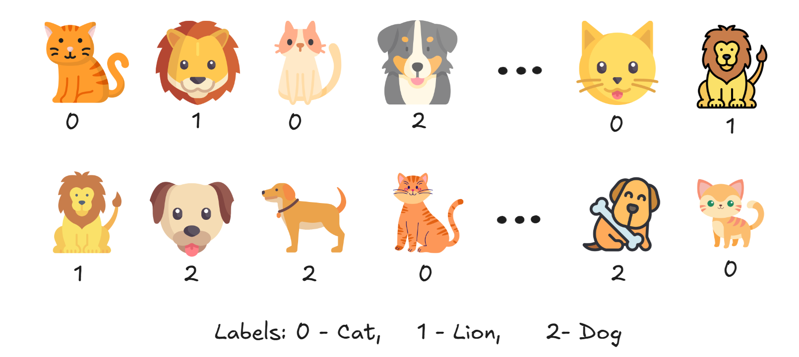
Step #1: Get Ground Truth and Prediction Probabilities
This code sets up test data for evaluating a three-class classifier that distinguishes between cats, lions, and dogs. The y_true list contains the ground truth labels for 30 samples (10 of each class), where:
- 0 represents Cat
- 1 represents Lion
- 2 represents Dog
The y_probs list contains the model's predicted probability distributions for each sample. Each inner list has three values representing the probability that the sample belongs to each class (Cat, Lion, Dog).
# Ground truth labels (0 = Cat, 1 = Lion, 2 = Dog)
y_true = [
    0, 0, 0, 0, 0, 0, 0, 0, 0, 0,  # Cat
    1, 1, 1, 1, 1, 1, 1, 1, 1, 1,  # Lion
    2, 2, 2, 2, 2, 2, 2, 2, 2, 2   # Dog
]

# Predicted probabilities for each class (Cat, Lion, Dog)
y_probs = [
    [0.95, 0.03, 0.02],  # Cat (confident)
    [0.90, 0.05, 0.05],
    [0.85, 0.10, 0.05],
    [0.70, 0.20, 0.10],
    [0.60, 0.25, 0.15],
    [0.40, 0.45, 0.15],  # misclassified
    [0.35, 0.40, 0.25],
    [0.25, 0.55, 0.20],
    [0.20, 0.30, 0.50],  # misclassified as Bird
    [0.10, 0.20, 0.70],  # misclassified

    [0.10, 0.85, 0.05],  # Lion (confident)
    [0.05, 0.90, 0.05],
    [0.10, 0.80, 0.10],
    [0.20, 0.70, 0.10],
    [0.25, 0.65, 0.10],
    [0.40, 0.50, 0.10],
    [0.50, 0.40, 0.10],
    [0.60, 0.30, 0.10],  # misclassified
    [0.30, 0.30, 0.40],  # misclassified as Bird
    [0.20, 0.25, 0.55],  # misclassified

    [0.10, 0.15, 0.75],  # Dog (confident)
    [0.10, 0.10, 0.80],
    [0.05, 0.15, 0.80],
    [0.20, 0.20, 0.60],
    [0.15, 0.25, 0.60],
    [0.20, 0.35, 0.45],
    [0.25, 0.40, 0.35],  # misclassified
    [0.30, 0.30, 0.40],  # confused
    [0.35, 0.30, 0.35],
    [0.40, 0.30, 0.30]   # misclassified
]
Step #2: One-vs-Rest Binarization
Here, we want to compare a single class vs "all other classes" (i.e., a one-vs-rest comparison) and compute a separate ROC curve for each class. Therefore, Binarization is needed since OvR converts a multi-class problem into multiple binary problems (each class vs. all others). So original multi-class labels should be transformed into a format that supports this approach.
# Binarize ground truth
y_bin = label_binarize(y_true, classes=[0, 1, 2])
Now y_bin looks like following.
[[1 0 0]
 [0 1 0]
 [0 0 1]
 ...
]
Step #3: ROC Curve and AUC per Class
Now we calculates ROC curves and AUC scores for a 3-class classification problem. For each of the three classes (indexed as 0, 1, and 2), it computes a separate ROC curve by treating that class as the positive class and all others as negative.
fpr = dict()
tpr = dict()
roc_auc = dict()
n_classes = 3

for i in range(n_classes):
    fpr[i], tpr[i], _ = roc_curve(y_bin[:, i], [p[i] for p in y_probs])
    roc_auc[i] = auc(fpr[i], tpr[i])
Step #4: Compute Micro and Macro Average AUC
Here, we calculate and reports both micro-average and macro-average AUC scores for the multi-class classification problem. The roc_auc_score function is used twice with different averaging parameters: "micro" combines all classes into a single binary classification problem before calculating AUC (giving more weight to larger classes), while "macro" calculates the AUC for each class separately and then averages them (treating all classes equally regardless of size). The multi_class="ovr" parameter specifies that a One-vs-Rest approach should be used.
micro_auc = roc_auc_score(y_bin, y_probs, average="micro", multi_class="ovr")
macro_auc = roc_auc_score(y_bin, y_probs, average="macro", multi_class="ovr")

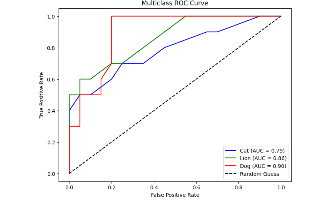
print(f"Class 0 (Cat) AUC:  {roc_auc[0]:.2f}")
print(f"Class 1 (Lion) AUC:  {roc_auc[1]:.2f}")
print(f"Class 2 (Dog) AUC: {roc_auc[2]:.2f}")
print(f"\nMicro-average AUC: {micro_auc:.2f}")
print(f"Macro-average AUC: {macro_auc:.2f}")
Step #5: Plot ROC Curves
Finally, the results are plotted.
plt.figure(figsize=(8, 6))
colors = ['blue', 'green', 'red']
class_names = ['Cat', 'Lion', 'Dog']

for i in range(n_classes):
    plt.plot(fpr[i], tpr[i], label=f"{class_names[i]} (AUC = {roc_auc[i]:.2f})", color=colors[i])

plt.plot([0, 1], [0, 1], 'k--', label='Random Guess')
plt.xlabel("False Positive Rate")
plt.ylabel("True Positive Rate")
plt.title("Multiclass ROC Curve")
plt.legend()
plt.grid(False)
plt.show()
You should see the following output when you run the code.
Example #3: Comparing Multiple Classifiers
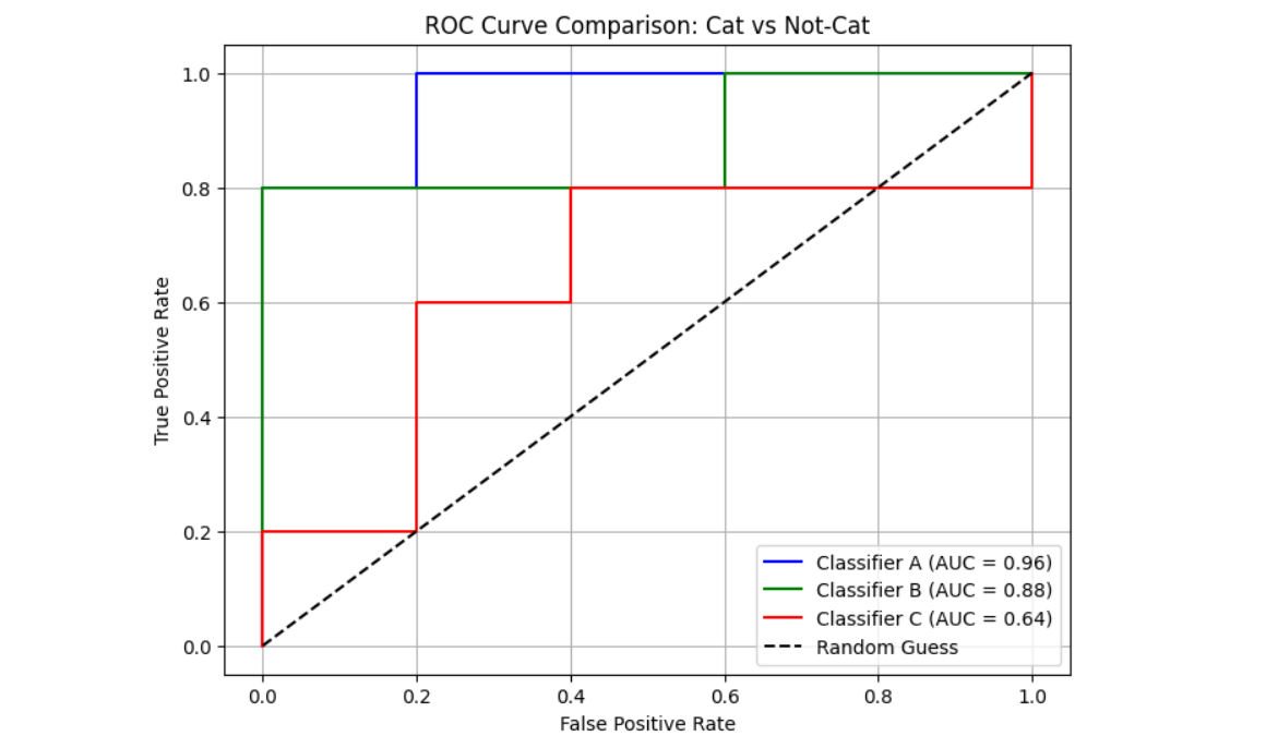
AUC ROC is an excellent metric for comparing different binary classifiers (Classifier A, B and C in our example). We will dive into an example comparing multiple binary image classifiers to predict "cat" vs "not cat" image.
In this example, we will simulate data with ground truth labels and predicted probabilities from each model, and then:
- Compute ROC AUC scores
- Plot their ROC curves for comparison
Step #1: Load Ground Truth and Probabilities
First we load the ground truth and assume and load probabilities from the three models.
# Ground truth: 1 = Cat, 0 = Not-Cat
y_true = [1, 0, 0, 1, 1, 0, 1, 0, 0, 1]

# Classifier predictions
models = {
    "Classifier A": [0.99, 0.34, 0.78, 0.97, 0.66, 0.50, 0.98, 0.60, 0.48, 0.95],
    "Classifier B": [0.62, 0.35, 0.49, 0.31, 0.75, 0.20, 0.78, 0.52, 0.30, 0.82],
    "Classifier C": [0.85, 0.50, 0.53, 0.62, 0.54, 0.71, 0.26, 0.60, 0.49, 0.67]
}
Step #2: Compute the AUC and ROC
Now compute the AUC ROC.
# Compute ROC and AUC
fpr, tpr, roc_auc = {}, {}, {}
for name, probs in models.items():
    fpr[name], tpr[name], _ = roc_curve(y_true, probs)
    roc_auc[name] = auc(fpr[name], tpr[name])
Step #3: Visualize the Results
Now we visualize the results. We first plot the individual ROC curve and AUC score for the three classifiers.
# -------------------------------
# Plot Individual ROC Curves
# -------------------------------
for name in models:
    plt.figure(figsize=(6, 5))
    plt.plot(fpr[name], tpr[name], label=f"{name} (AUC = {roc_auc[name]:.2f})", color=colors[name])
    plt.plot([0, 1], [0, 1], 'k--', label='Random Guess')
    plt.xlabel('False Positive Rate')
    plt.ylabel('True Positive Rate')
    plt.title(f'ROC Curve: {name}')
    plt.legend()
    plt.grid(True)
    plt.show()
You should see following output.

And also plot the comparative ROC curve for all of the three classifiers.
# -------------------------------
# Plot Combined ROC Comparison
# -------------------------------
plt.figure(figsize=(8, 6))
for name in models:
    plt.plot(fpr[name], tpr[name], label=f"{name} (AUC = {roc_auc[name]:.2f})", color=colors[name])

plt.plot([0, 1], [0, 1], 'k--', label='Random Guess')
plt.xlabel('False Positive Rate')
plt.ylabel('True Positive Rate')
plt.title('ROC Curve Comparison: Cat vs Not-Cat')
plt.legend()
plt.grid(True)
plt.show()
The following will be the output.
Understanding AUC-ROC
AUC-ROC is a powerful and widely used metric for evaluating classification models, especially in computer vision tasks like image classification. It provides a clear picture of how well a model distinguishes between classes across different thresholds.
By visualizing the ROC curve and summarizing performance with the AUC score, you can compare models effectively, even with imbalanced data or when tuning thresholds. In computer vision, where predictions often involve probabilities (e.g., "cat" vs. "not cat"), AUC-ROC helps assess how confidently and accurately a model separates visual categories. AUC-ROC is an essential tool for evaluating and improving model performance.
With Roboflow, you can easily train, evaluate, and deploy models while leveraging powerful metrics like AUC-ROC to optimize performance. Sign up for free today to start building and refining AI models.
Cite this Post
Use the following entry to cite this post in your research:
Timothy M. (Apr 1, 2025). What Is AUC-ROC?. Roboflow Blog: https://blog.roboflow.com/what-is-auc-roc/
