
Real world deployments of IoT sensors can generate massive amounts of time series data that traditional analysis methods struggle to interpret effectively. This blog post intends to demonstrate how Gramian Angular Difference Fields (GADF) can transform complex time series data into visual patterns that deep learning models can classify with remarkable accuracy.
In this post we will be converting sensor readings into images and training a ResNet18 classification model through Roboflow. In this example use case we achieved robust fault detection capabilities for various HVAC failure modes including filter blockages, duct obstructions, and maintenance-related issues.
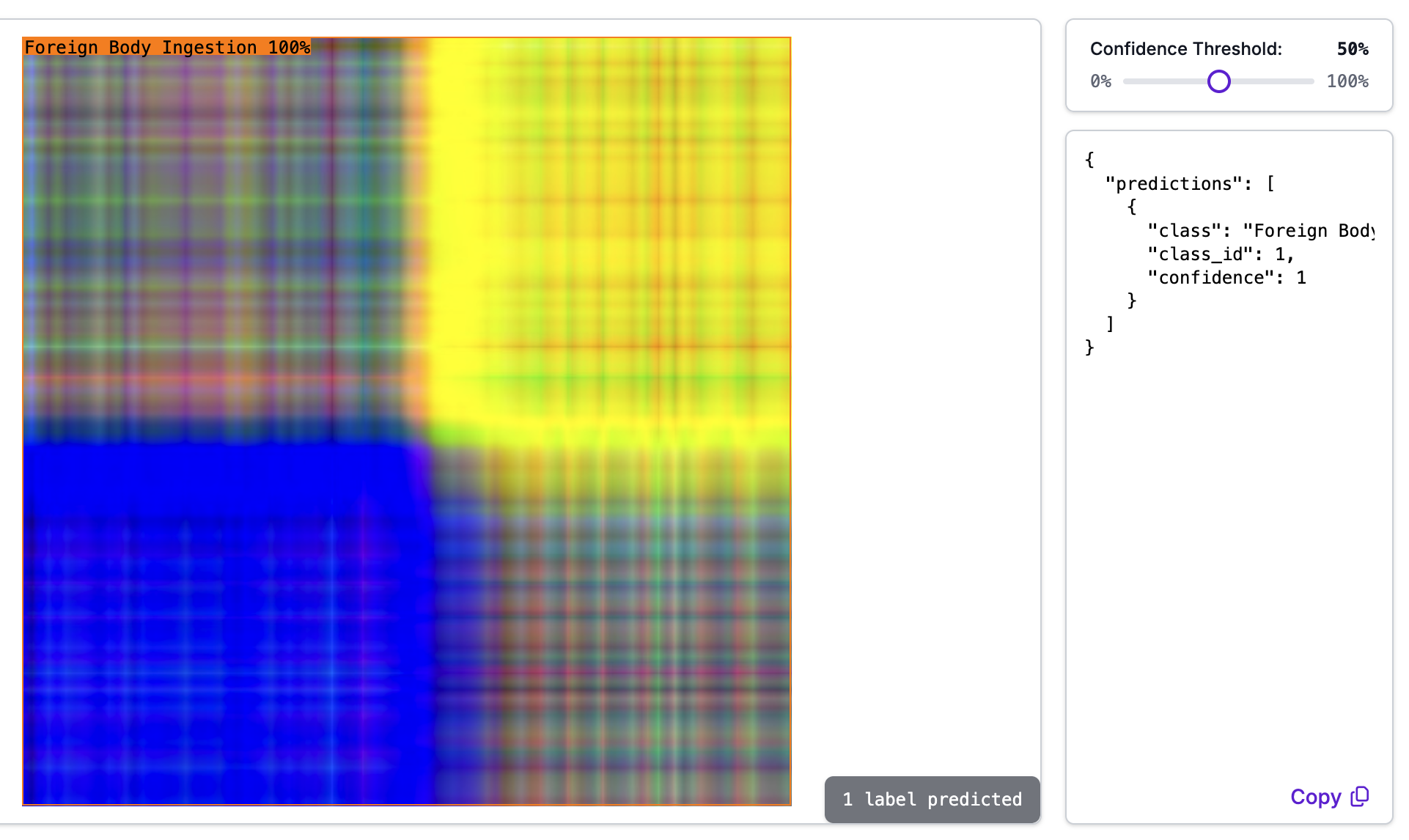
Here is an example showing the results of transformed sensor readings being passed through an image classification model:
Understanding Gramian Angular Difference Fields
Gramian Angular Difference Fields are a breakthrough approach to time series analysis that converts one-dimensional temporal data into two-dimensional images. Originally proposed by Wang and Oates in 2015, this technique leverages the power of computer vision methods for time series classification and analysis.
The GADF transformation works by first normalizing the time series data, then converting it to polar coordinates where each value becomes an angular cosine with time as the radius. The mathematical foundation preserves temporal dependencies while creating visual patterns that convolutional neural networks can effectively interpret (further reading).
GADF maintains the complete temporal structure of the original signal while creating distinctive visual signatures for different system behaviors. This approach has proven successful across diverse applications including rolling bearing fault diagnosis, HVDC transmission line monitoring, and photovoltaic system anomaly detection.
Typically, GADF's are used to encode a single time series, for example the temperature outside but often this only tells a small part of a larger story. Often these time series come in related sets like temperature, humidity and pressure and it is much more useful to look at them together rather than individually. A limitation of GADF's are that they are simply 2-dimensional matrices and while they are often encoded in color, they are inherently monochrome.
So, how do we encode multiple time series into a single image to be fed into an image classifier? We stack 3 GADF's and assign each to it's own color channel: red, green and blue, much like the image at the top of this post.
Data Collection and Fault Scenarios
For this project, I collected IoT data from my home HVAC system using Home Assistant running on a Raspberry Pi. The sensor setup monitored three critical parameters: upstream pressure ahead of the filter, downstream pressure after the filter, and motor speed. Each measurement session captured approximately three minutes of data at regular intervals, providing sufficient temporal resolution to observe system dynamics.
The experimental design included both normal operation baselines and several deliberately induced fault conditions. Normal operation data captured the HVAC system running under typical conditions with clean filters and unobstructed airflow.
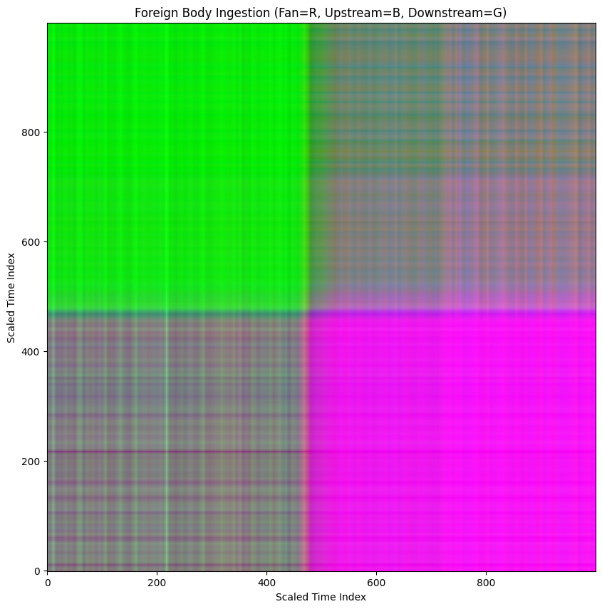
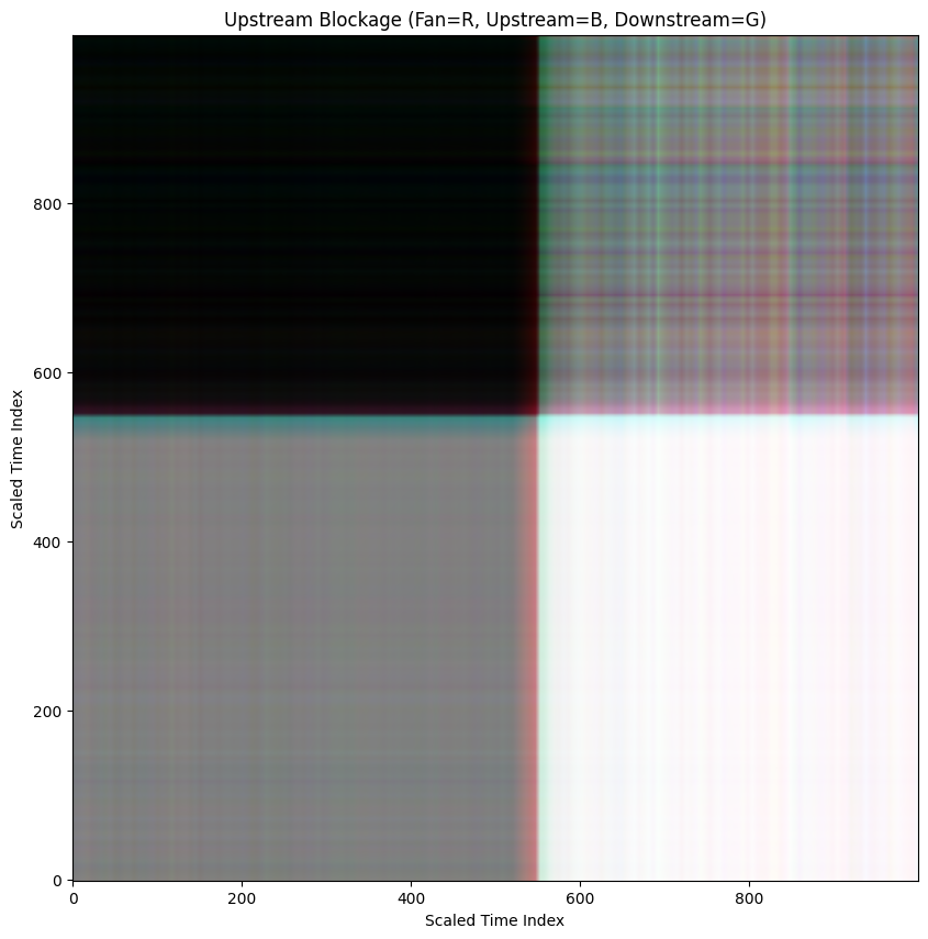
The fault scenarios were designed to simulate real-world problems that homeowners and technicians encounter: foreign body ingestion where debris travels through the system and accumulates at the filter, upstream blockage simulating duct obstructions before the filter and downstream blockage representing restrictions after the filter.
I also captured maintenance scenarios including opening the access hatch and replacing the filter, and incomplete maintenance where the filter is replaced but the hatch isn't properly closed.
These fault modes create distinct signatures in the pressure differential and motor speed data. For example, upstream blockages typically increase the pressure differential across the filter while forcing the motor to work harder, whereas downstream blockages create different pressure patterns as the system struggles to maintain airflow. The motor speed variations provide additional diagnostic information, as the system's control algorithms attempt to compensate for changing load conditions.
Implementation: Converting Time Series to GADF Images
The transformation from raw sensor data to GADF images involves several key preprocessing steps that ensure optimal results for machine learning classification. First, the raw time series data undergoes normalization to bring all sensor readings into a consistent range, typically 0-1. This normalization step is crucial because it ensures that different sensor types (pressure and speed) contribute equally to the final image representation.
# This code assumes that there are 3 csv files for fan speed, upstream and downstream pressures
# The first column is time elapsed in seconds, the second column is the raw measurement values

import numpy as np
import pandas as pd
from scipy.interpolate import interp1d
import matplotlib.pyplot as plt

def read_and_process_csv(filepath):
    # Read the CSV file assuming no header and time is already seconds elapsed
    df = pd.read_csv(filepath, header=None)

    # Add the column headers assuming the first column is time (seconds) and the second is value
    df.columns = ["time_seconds", "value"]

    # Convert the DataFrame to a NumPy array
    numpy_array = df[['time_seconds', 'value']].to_numpy()

    return numpy_array

# Define the file paths
downstream_filepath = '****'
upstream_filepath = '****'
fan_filepath = '****'

# Read and process each file
downstream_data = read_and_process_csv(downstream_filepath)
upstream_data = read_and_process_csv(upstream_filepath)
fan_data = read_and_process_csv(fan_filepath)

# Normalize time and values to both be in the range 0-1
# Next, make all 3 arrays size (1000,2) by interpolating between values
def normalize_and_interpolate(data, target_size=1000):
    # Normalize time (first column)
    time_min = data[:, 0].min()
    time_max = data[:, 0].max()
    normalized_time = (data[:, 0] - time_min) / (time_max - time_min)

    # Normalize value (second column)
    value_min = data[:, 1].min()
    value_max = data[:, 1].max()
    normalized_value = (data[:, 1] - value_min) / (value_max - value_min)

    # Create an interpolation function for the normalized value based on normalized time
    interp_func = interp1d(normalized_time, normalized_value, kind='linear')

    # Create new time points for interpolation ranging from 0 to 1
    new_time_points = np.linspace(0, 1, target_size)

    # Interpolate the normalized value at the new time points
    interpolated_value = interp_func(new_time_points)

    # Combine the new time points and interpolated value into a new array
    interpolated_data = np.vstack((new_time_points, interpolated_value)).T

    return interpolated_data

# Normalize and interpolate each dataset
downstream_normalized_interpolated = normalize_and_interpolate(downstream_data)
upstream_normalized_interpolated = normalize_and_interpolate(upstream_data)
fan_normalized_interpolated = normalize_and_interpolate(fan_data)

# Create a figure and a set of subplots
fig, axes = plt.subplots(1, 3, figsize=(15, 5)) # 1 row, 3 columns

# Plot the first array
axes[0].plot(downstream_normalized_interpolated[:, 0], downstream_normalized_interpolated[:, 1])
axes[0].set_title('Downstream Sensor Data')
axes[0].set_xlabel('Normalized Time')
axes[0].set_ylabel('Normalized Value')

# Plot the second array
axes[1].plot(upstream_normalized_interpolated[:, 0], upstream_normalized_interpolated[:, 1])
axes[1].set_title('Upstream Sensor Data')
axes[1].set_xlabel('Normalized Time')
axes[1].set_ylabel('Normalized Value')

# Plot the third array
axes[2].plot(fan_normalized_interpolated[:, 0], fan_normalized_interpolated[:, 1])
axes[2].set_title('Fan Sensor Data')
axes[2].set_xlabel('Normalized Time')
axes[2].set_ylabel('Normalized Value')

# Adjust layout to prevent overlapping titles/labels
plt.tight_layout()

# Show the plots
plt.show()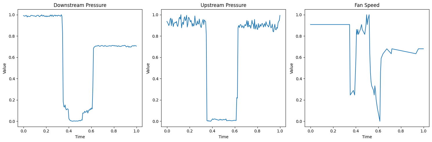
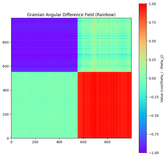
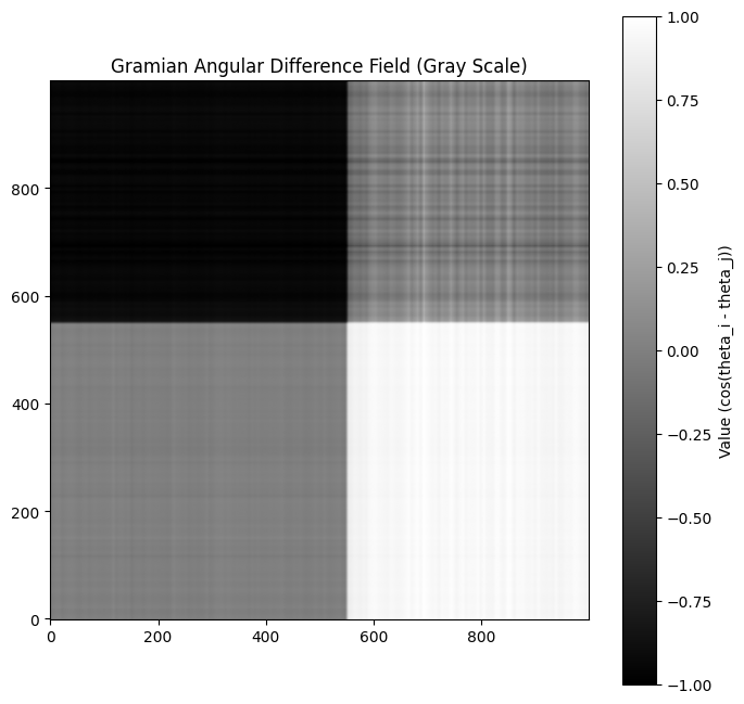
Next, a GADF is computed for each time series using the pyts python library.
from pyts.image import GramianAngularField

# Initialize GADF transformer
# Using method='difference' for Gramian Angular Difference Field
gadf = GramianAngularField(image_size=1000, method='difference')

# Reshape the data to fit the transformer (needs shape [n_samples, n_timestamps])
# Here, n_samples is 1 for each series, and n_timestamps is 1000
downstream_reshaped = downstream_normalized_interpolated[:, 1].reshape(1, -1)
upstream_reshaped = upstream_normalized_interpolated[:, 1].reshape(1, -1)
fan_reshaped = fan_normalized_interpolated[:, 1].reshape(1, -1)


# Compute the GADF for each array
downstream_gadf = gadf.fit_transform(downstream_reshaped)
upstream_gadf = gadf.fit_transform(upstream_reshaped)
fan_gadf = gadf.fit_transform(fan_reshaped)


# The result is a 3D array (n_samples, image_size, image_size).
# Since we have 1 sample, we take the first element [0] to get the 2D image.
downstream_gadf_image = downstream_gadf[0]
upstream_gadf_image = upstream_gadf[0]
fan_gadf_image = fan_gadf[0]

# Plot the GADF images side by side
fig, axes = plt.subplots(1, 3, figsize=(18, 6)) # 1 row, 3 columns

# Plot the GADF for the first array
im1 = axes[0].imshow(downstream_gadf_image, cmap='gray', origin='lower', vmin=-1., vmax=1.)
axes[0].set_title('Downstream GADF')
axes[0].set_xlabel('Time Index')
axes[0].set_ylabel('Time Index')
fig.colorbar(im1, ax=axes[0])

# Plot the GADF for the second array
im2 = axes[1].imshow(upstream_gadf_image, cmap='gray', origin='lower', vmin=-1., vmax=1.)
axes[1].set_title('Upstream GADF')
axes[1].set_xlabel('Time Index')
axes[1].set_ylabel('Time Index')
fig.colorbar(im2, ax=axes[1])


# Plot the GADF for the third array
im3 = axes[2].imshow(fan_gadf_image, cmap='gray', origin='lower', vmin=-1., vmax=1.)
axes[2].set_title('Fan GADF')
axes[2].set_xlabel('Time Index')
axes[2].set_ylabel('Time Index')
fig.colorbar(im3, ax=axes[2])


# Adjust layout to prevent overlapping titles/labels
plt.tight_layout()

# Show the plots
plt.show()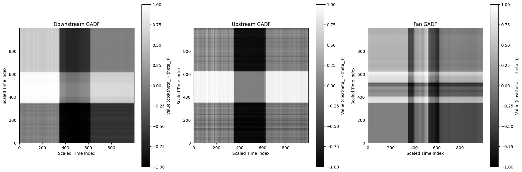
Finally the GADF's are stacked, assigning the fan to the red channel, upstream pressure to blue and downstream pressure to green.
# Create an empty array for the RGB image
# The shape will be (image_size, image_size, 3)
image_size = downstream_gadf_image.shape[0]
rgb_image = np.zeros((image_size, image_size, 3))

# Assign the scaled GADF images to the appropriate channels
rgb_image[:, :, 0] = fan_scaled      # Red channel: Fan
rgb_image[:, :, 1] = downstream_scaled # Green channel: Downstream
rgb_image[:, :, 2] = upstream_scaled  # Blue channel: Upstream

# Display the stacked RGB image
plt.figure(figsize=(8, 8))
plt.imshow(rgb_image, origin='lower')
plt.title('Stacked GADF Image (R: Fan, G: Downstream, B: Upstream)')
plt.show()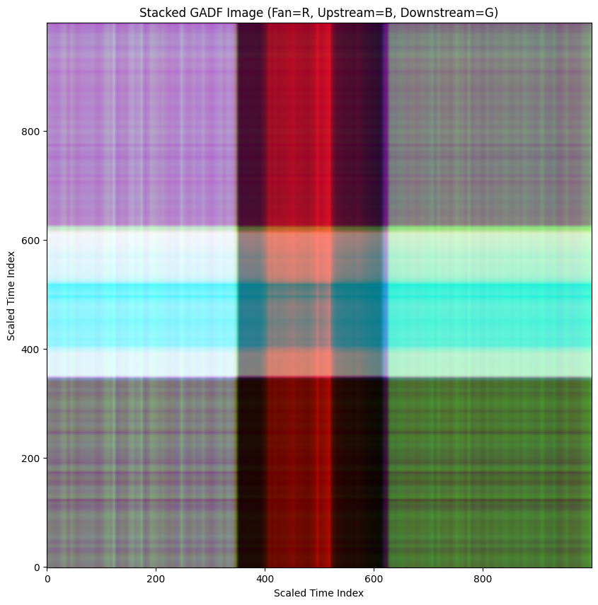
When we perform this operation across all data sets we find that each operational state creates a very distinctive pattern.
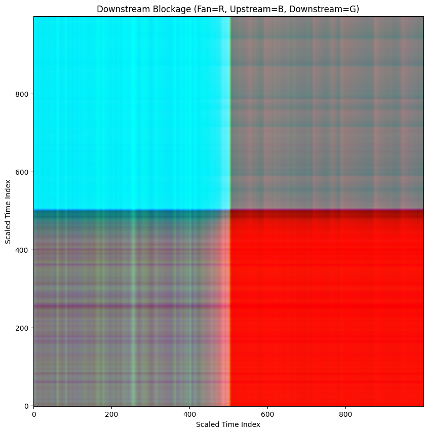
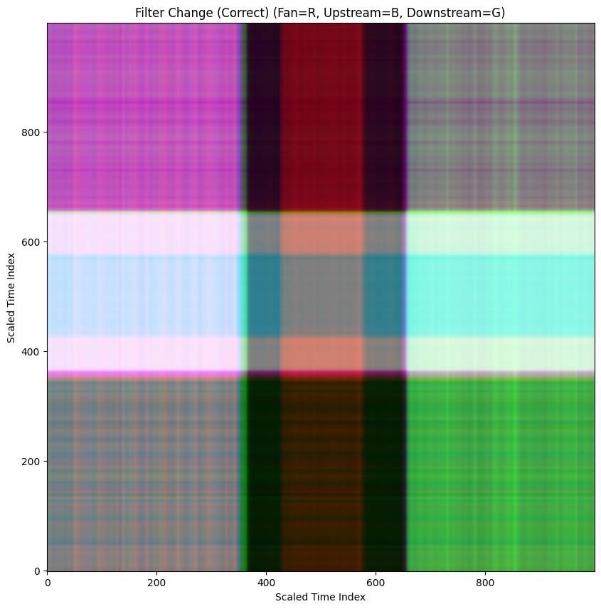
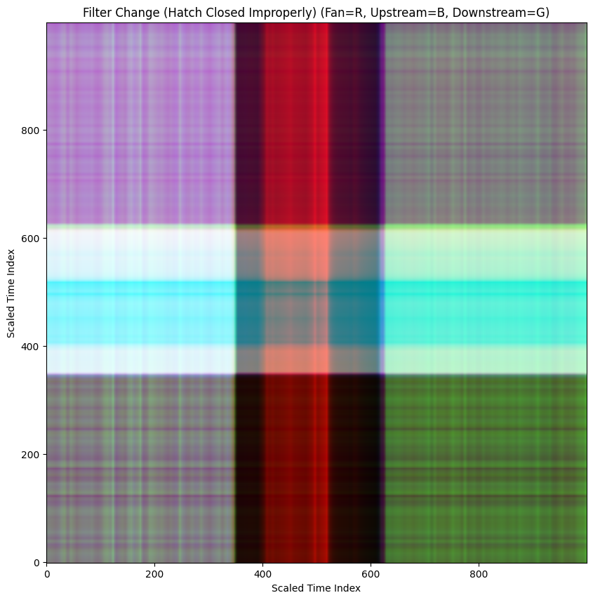
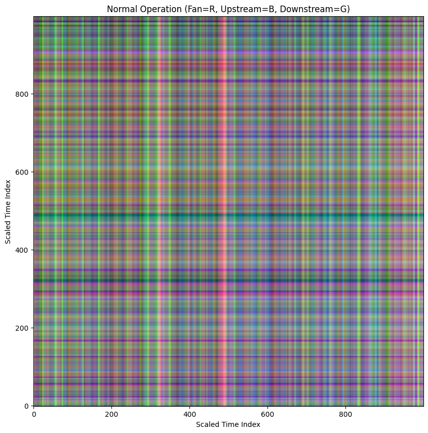
Unfortunately, in practice we don't know when these kinds of failures are going to occur so it is important to catch these conditions in real time. In order to create a representative set of GADF's for each state, I used a rolling 60 second window that moves across the data set mimicking an incoming live data stream.
def sliding_window(data, window_size=(500, 2)):
    window_height, window_width = window_size
    if window_width != data.shape[1]:
        raise ValueError(f"Window width must match the number of columns in data ({data.shape[1]})")

    if window_height > data.shape[0]:
        print(f"Warning: Window height ({window_height}) is larger than the data length ({data.shape[0]}). Returning the original data as a single window.")
        return [data]

    windows = []
    # The number of possible starting points for the window
    num_windows = data.shape[0] - window_height + 1

    for i in range(num_windows):
        # Slice the data to get the current window
        window = data[i : i + window_height, :]
        windows.append(window)

    return windows

# Apply the sliding window to each normalized and interpolated array
window_size = (500, 2)

downstream_windows = sliding_window(downstream_normalized_interpolated, window_size)
upstream_windows = sliding_window(upstream_normalized_interpolated, window_size)
fan_windows = sliding_window(fan_normalized_interpolated, window_size)
When the sliding windows are plotted together and looped into a video, this is what you get.
60 sec sliding window (4x speed)
This rolling window ultimately produces 300-600 distinct sets of plots for each state. Next we need to convert each set of plots into a GADF.
import os

def create_gadf_and_save_image(data_windows, directory_prefix):
    # Initialize GADF transformer
    # Using method='difference' for Gramian Angular Difference Field
    # The image_size should match the window height
    window_height = data_windows[0].shape[0] if data_windows else 0
    if window_height == 0:
        print(f"No windows found for {directory_prefix}. Skipping GADF generation.")
        return

    gadf_transformer = GramianAngularField(image_size=window_height, method='difference')

    # Ensure the base directory exists
    base_dir = f'*****/{directory_prefix}' #----------------select save directory here
    os.makedirs(base_dir, exist_ok=True)

    for i, window in enumerate(data_windows):
        # Reshape the window data (only the value column) for the transformer
        # shape needs to be [n_samples, n_timestamps], here n_samples is 1
        reshaped_window = window[:, 1].reshape(1, -1)

        # Compute the GADF for the current window
        window_gadf = gadf_transformer.fit_transform(reshaped_window)

        # The result is a 3D array (n_samples, image_size, image_size).
        # Take the first element [0] to get the 2D image.
        gadf_image = window_gadf[0]

        # Create a directory for the sequence ID (window index)
        sequence_dir = os.path.join(base_dir, f'sequence_{i:04d}') # use 4 digits for sequence ID
        os.makedirs(sequence_dir, exist_ok=True)

        # Define the filename for the GADF image
        image_filename = os.path.join(sequence_dir, f'gadf_image_{i:04d}.png')

        # Create a figure without axes, legends, or sidebars
        plt.figure(figsize=(window_height/100.0, window_height/100.0), dpi=100) # Set figure size based on image size
        plt.imshow(gadf_image, cmap='gray', origin='lower', vmin=-1., vmax=1.)
        plt.axis('off') # Turn off axis
        plt.gca().set_position([0, 0, 1, 1]) # Remove borders

        # Save the figure
        plt.savefig(image_filename, bbox_inches='tight', pad_inches=0)

        # Close the figure to free memory
        plt.close()

        if (i + 1) % 100 == 0:
          print(f"Processed and saved {i+1} GADF images for {directory_prefix}")

    print(f"Finished processing and saving {len(data_windows)} GADF images for {directory_prefix}.")


# Process each set of windows and save the GADF images
create_gadf_and_save_image(downstream_windows, 'downstream_frames')
create_gadf_and_save_image(upstream_windows, 'upstream_frames')
create_gadf_and_save_image(fan_windows, 'fan_frames')
When the GADF's are looped into a video, this is what you get.
GADF of 60 sec sliding Window (4x speed)
Rinse and repeat for all 5 of our classes and we now have a couple thousand GADF's to upload to RoboFlow!
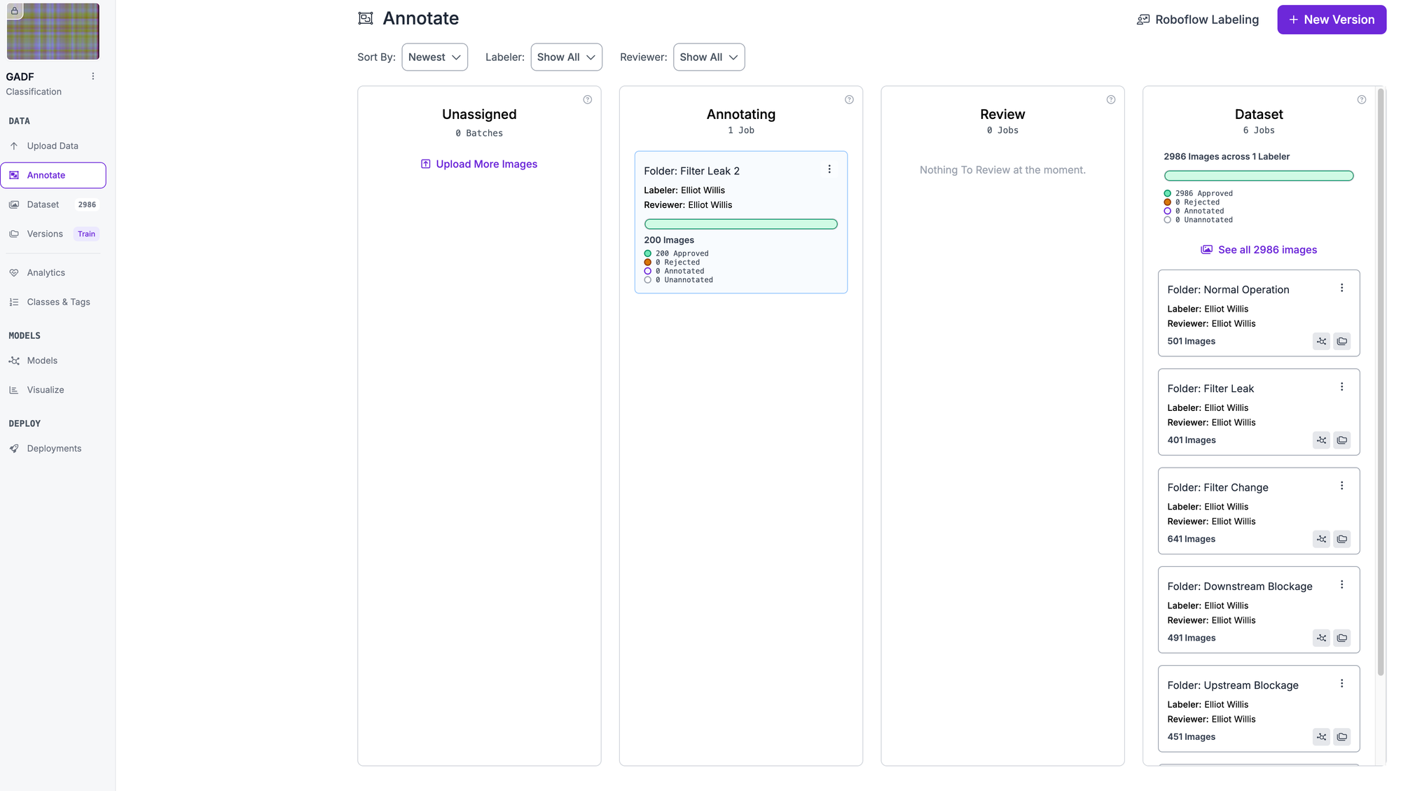
Training Classification Models with Roboflow
Roboflow's platform provides an ideal environment for training computer vision models on GADF images, offering both ease of use and powerful model architectures. The platform supports various classification models including ResNet architectures, which have proven particularly effective for time series image classification tasks.
The workflow begins by uploading the generated GADF images to Roboflow, organized by fault type classification. (The name of the folder will automatically be assigned as the class. This can be changed later but is a convenient way to label entire classes at the same time.)
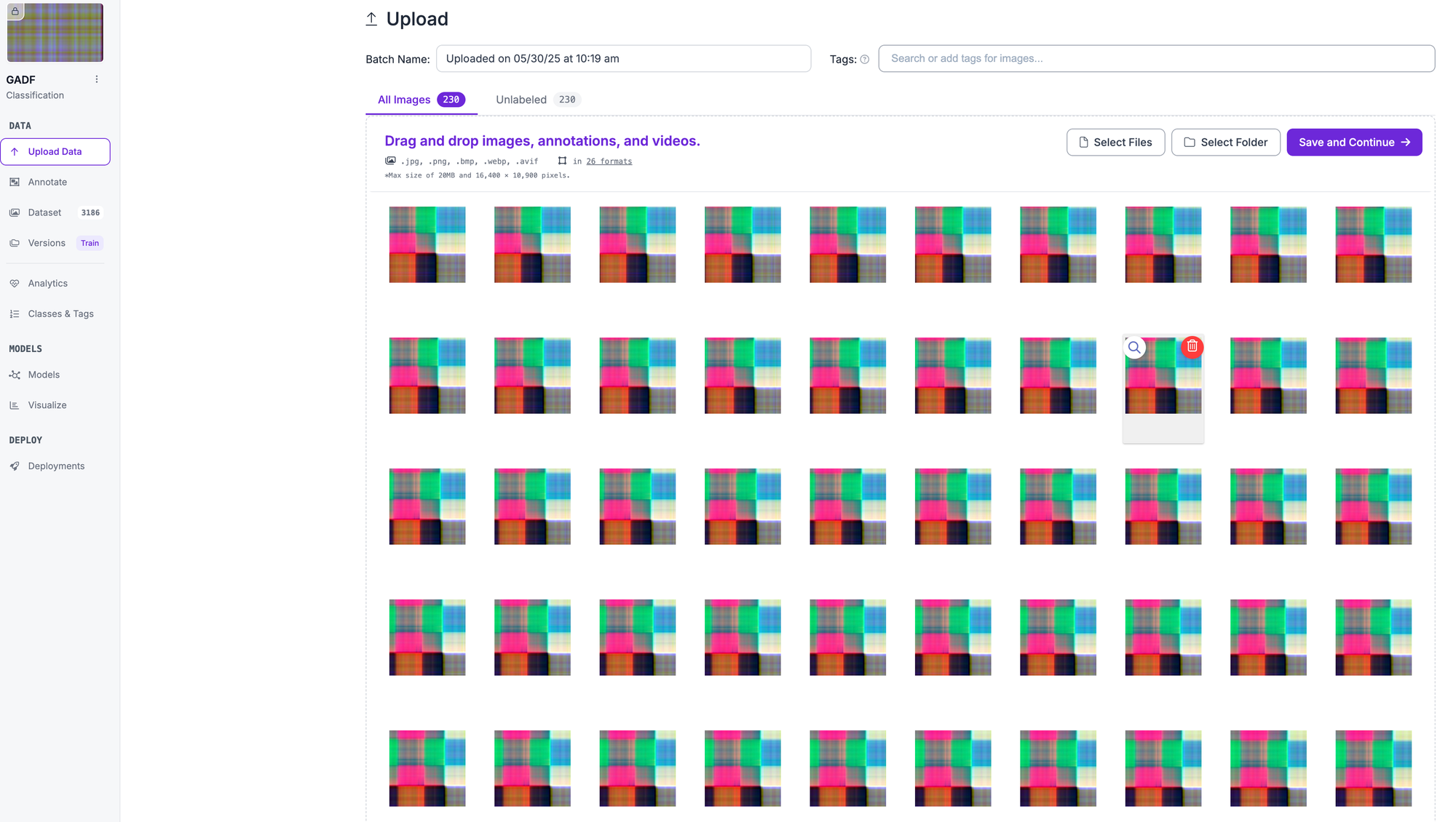
Next you verify the annotations, approve them and add them to your data set.
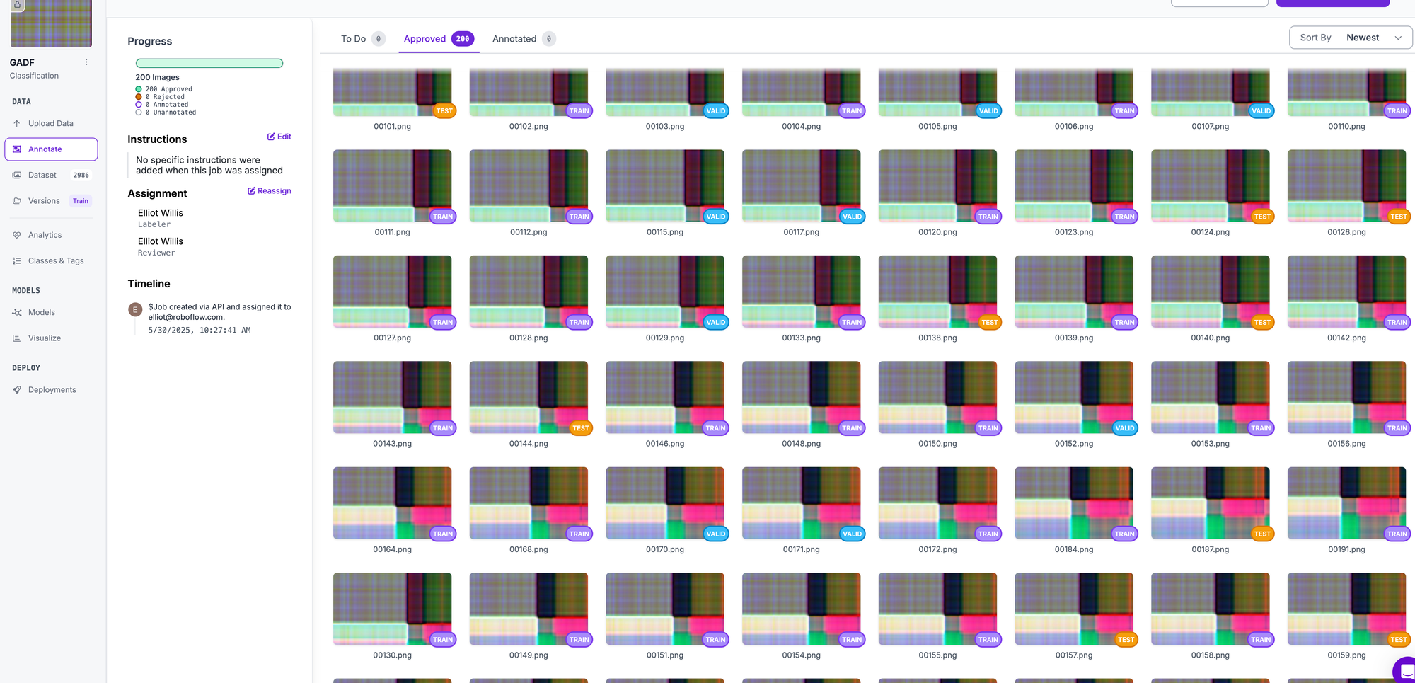
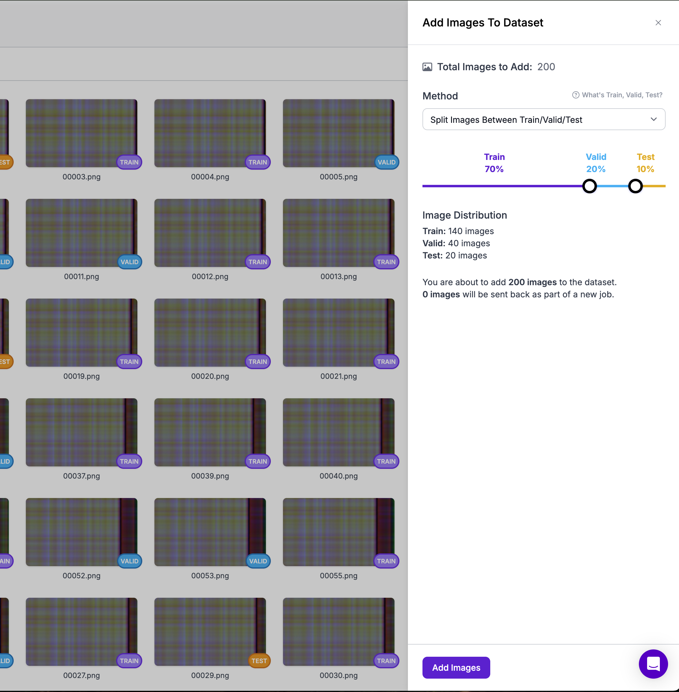
Once you've done this for all classes, it's time to create a new version of the data set. The platform handles train-test splits, preprocessing and data augmentation streamlining the machine learning pipeline significantly.
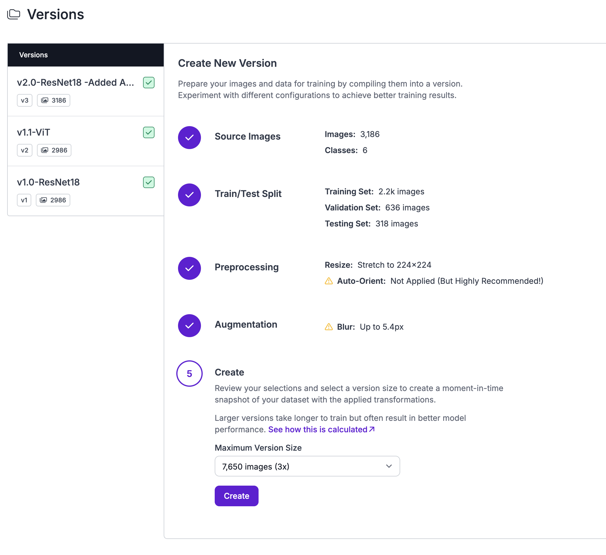
For this HVAC monitoring application, I selected ResNet18 as the base architecture due to its proven performance on image classification tasks and its balance between accuracy and computational efficiency.
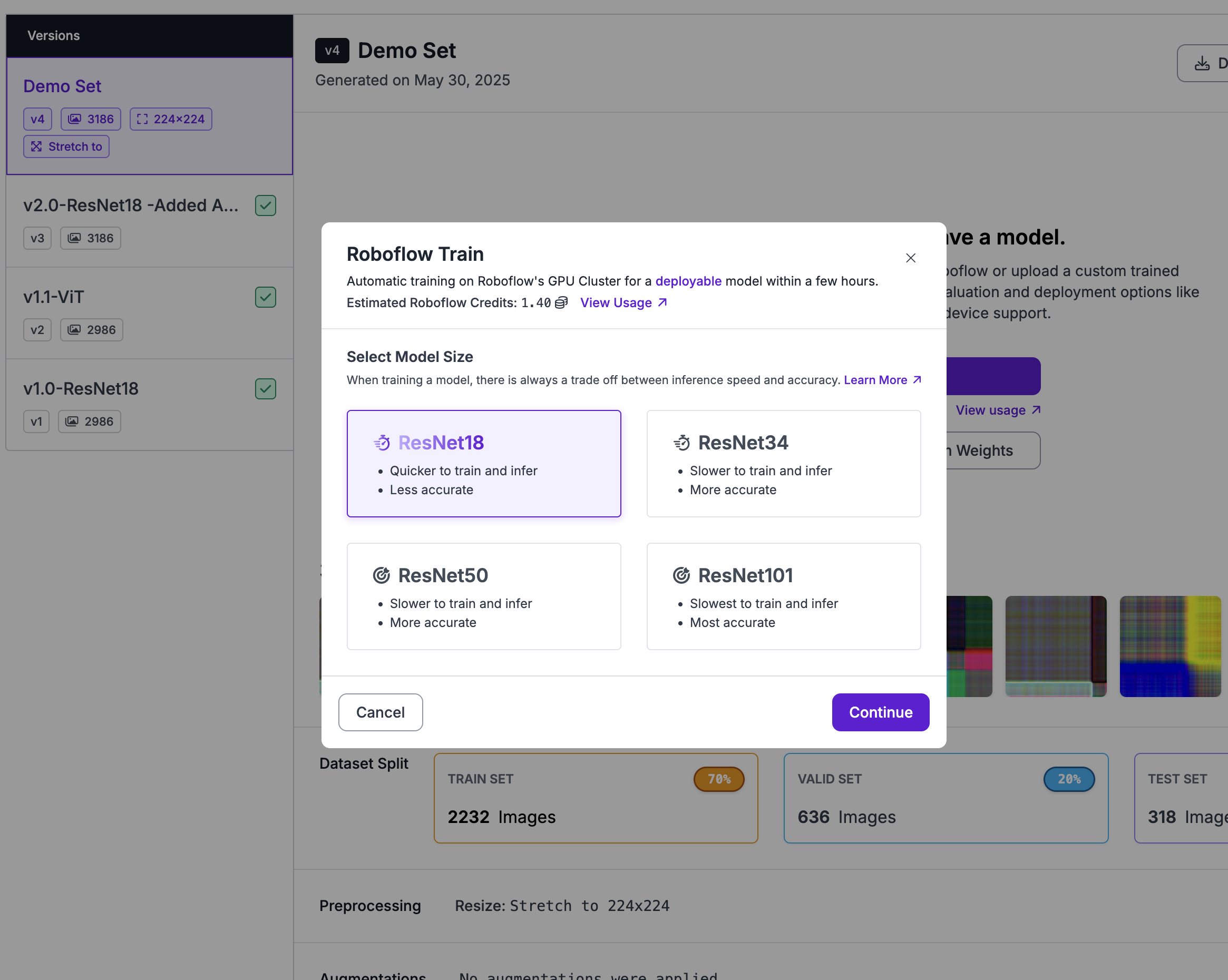
The training process leverages Roboflow's infrastructure to optimize the ResNet18 model for the specific characteristics of HVAC fault detection. The platform's automatic hyperparameter tuning and model optimization capabilities significantly reduce the time required to achieve production-ready performance. Training typically converges within a few hundred epochs, depending on the complexity and quantity of the training data.
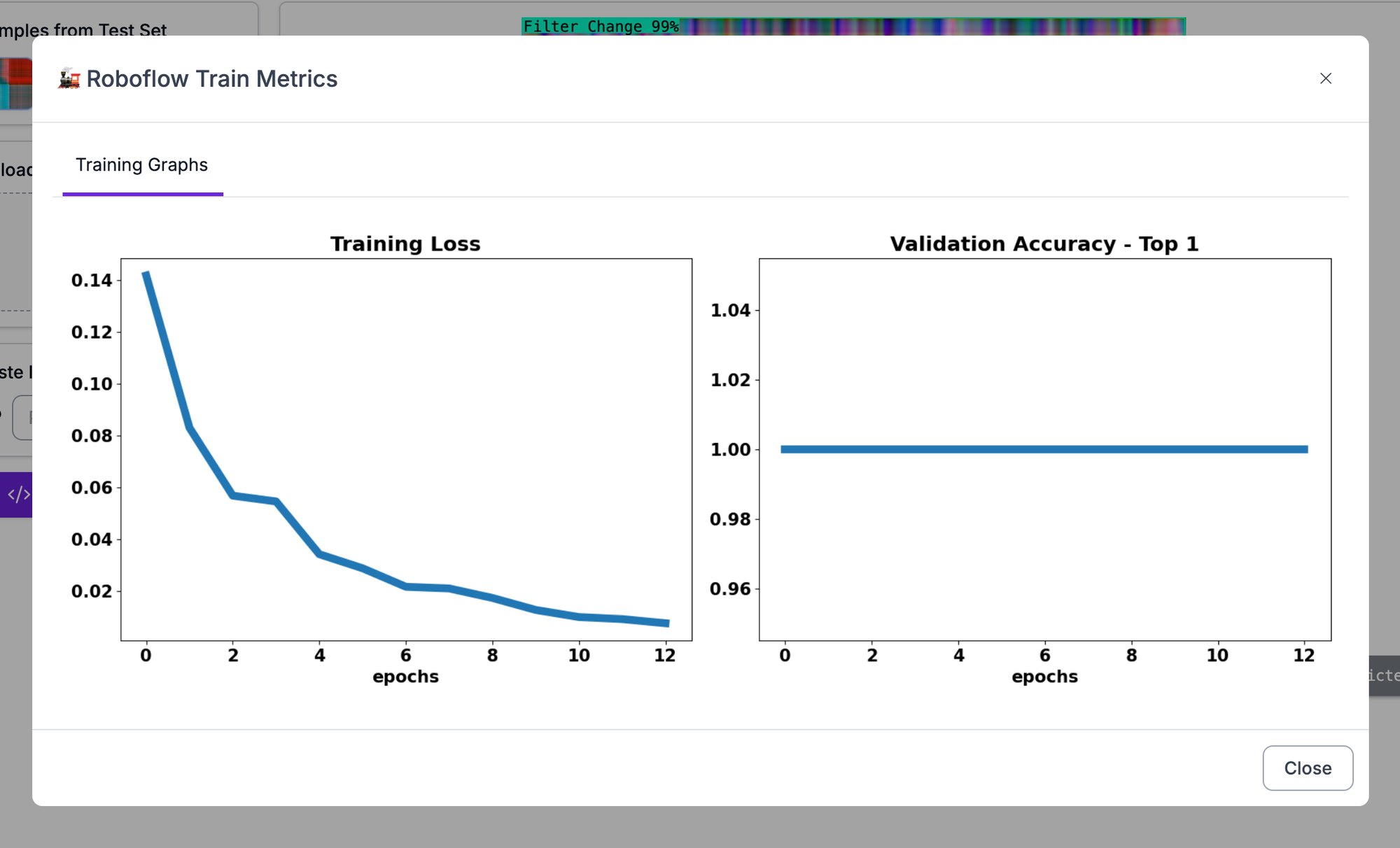
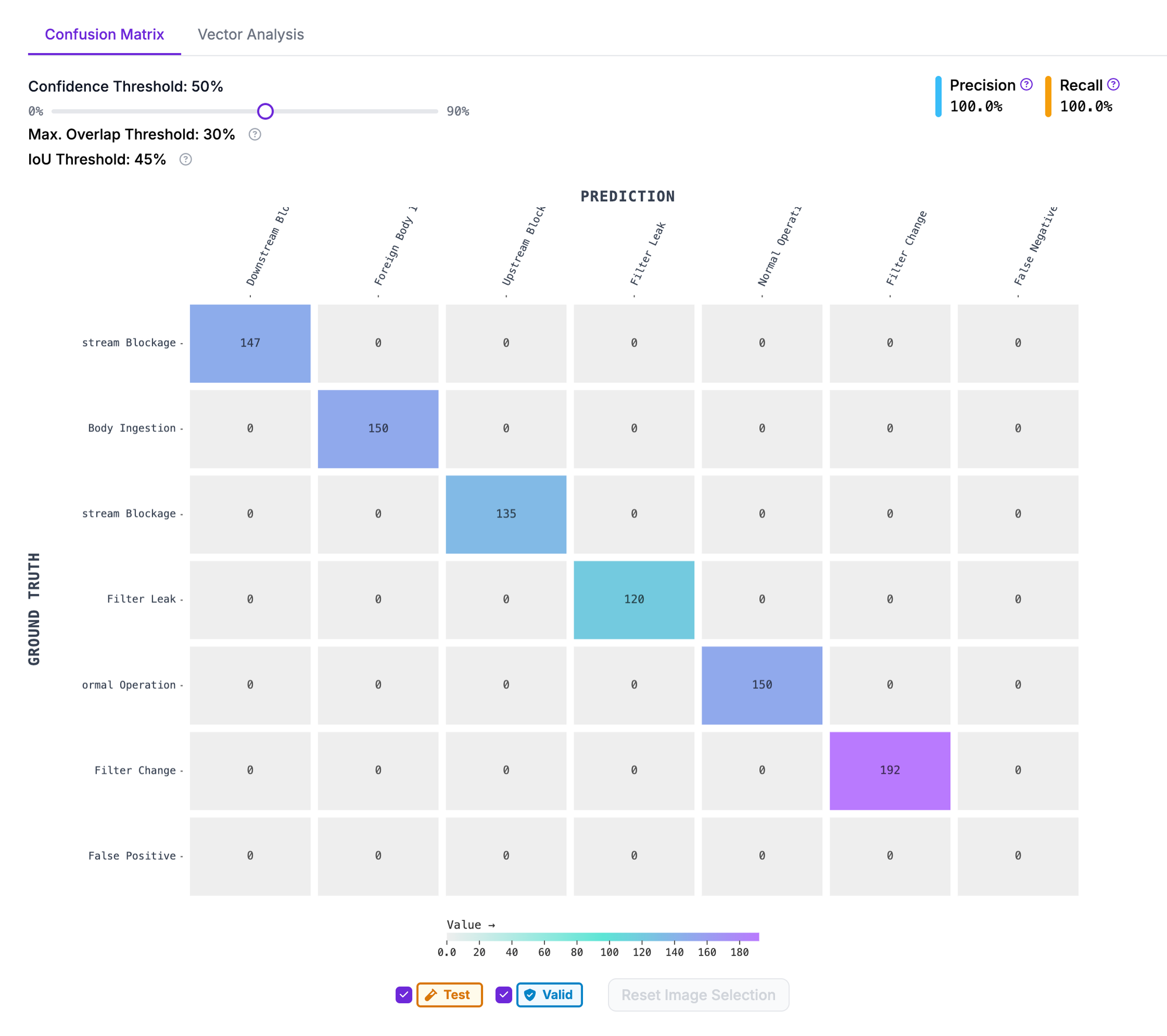
Validation results demonstrate the effectiveness of the GADF approach for fault classification. The trained model achieves high accuracy across all fault categories, with particularly strong performance in distinguishing between different types of blockages and maintenance-related issues. The visual nature of the GADF representation allows the convolutional neural network to learn spatial patterns that correspond to specific temporal relationships in the original sensor data.
Real-Time Application and Scalability
The combination of GADF transformation and Roboflow's deployment capabilities creates a powerful solution for large-scale IoT monitoring applications. The system can process streaming GADF images from live time series data and classifying them using the trained model. This approach scales effectively because each sensor or system can have its own dedicated model, while the underlying GADF transformation methodology remains consistent across different applications.
For production deployment using RoboFlow, the rolling window approach enables continuous monitoring without requiring batch processing of large datasets. As new sensor readings arrive every few seconds, the system maintains a sliding 60-second window of data, continuously generating fresh GADF images for classification. This real-time capability makes the approach suitable for immediate fault detection and automated alerting systems.
The scalability advantages become particularly apparent when managing multiple systems or extending the approach to other IoT applications. The same GADF transformation code can handle different sensor types and system configurations, while Roboflow's platform enables rapid training and deployment of specialized models for each use case. This modularity allows organizations to build comprehensive monitoring solutions that adapt to diverse equipment types and operational contexts.
Conclusion
The integration of Gramian Angular Difference Fields with modern computer vision platforms like Roboflow represents a significant advancement in IoT time series analysis capabilities. By transforming temporal sensor data into visual patterns, this approach unlocks the full potential of deep learning techniques for fault detection and system monitoring applications. The HVAC case study demonstrates how relatively simple sensor configurations can provide robust fault detection when processed through GADF transformation and classified using ResNet architectures.
As IoT deployments continue to generate ever-increasing volumes of time series data, techniques like GADF offer practical solutions for extracting actionable insights from complex temporal patterns. The combination with platforms like Roboflow further accelerates adoption by reducing the technical barriers to implementing sophisticated monitoring solutions across diverse industrial applications.
Cite this Post
Use the following entry to cite this post in your research:
Elliot Willis. (May 30, 2025). Fault Detection of IoT Time-Series Data using Roboflow and Multi-Channel Gramian Angular Difference Fields. Roboflow Blog: https://blog.roboflow.com/iot-time-series-fault-detection-computer-vision/