
Your designer sent over a url that begins with figma.com and asks you to take a look at their latest work. What is Figma, you wonder as you click through a series of screens, and how can I learn more about it? Wonder no more — you’ve come to the right place.
At Roboflow, we use Figma for designing and prototyping our product. To date, most major software programs have required a desktop install due to product complexity and relative installation size. In the age of cloud computing, the experience of product design software was lagging behind the exodus to the skies. Figma is unique in that it is a comprehensive design program that can run entirely in-browser. Figma can run in-browser, and it’s also offered as a wrapped desktop app, which is especially helpful if you tend to keep many tabs open.
What Figma Does
Figma is a vector drawing program. This means it can create scalable type and shapes that look crisp at any size. Figma files can also house bitmap images (though it’s not advisable to use extremely large, print-quality images for performance reasons). Figma is intended for screen design and work can be exported in jpg, png, svg, and pdf formats.
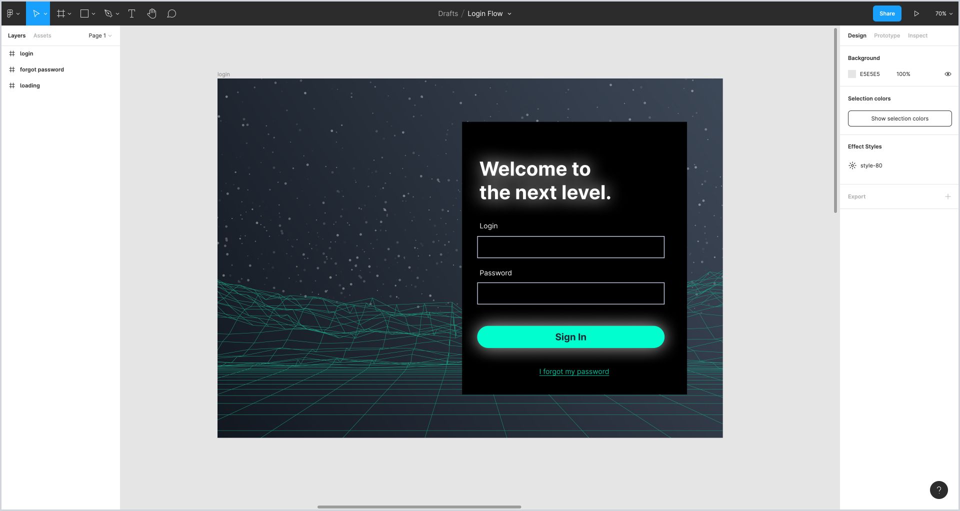
There are two main views in Figma: the canvas view and the prototype view. The canvas is where the design is created. It can be identified by the display of individual artboards (and, sometimes elements that aren’t tied to an artboard).
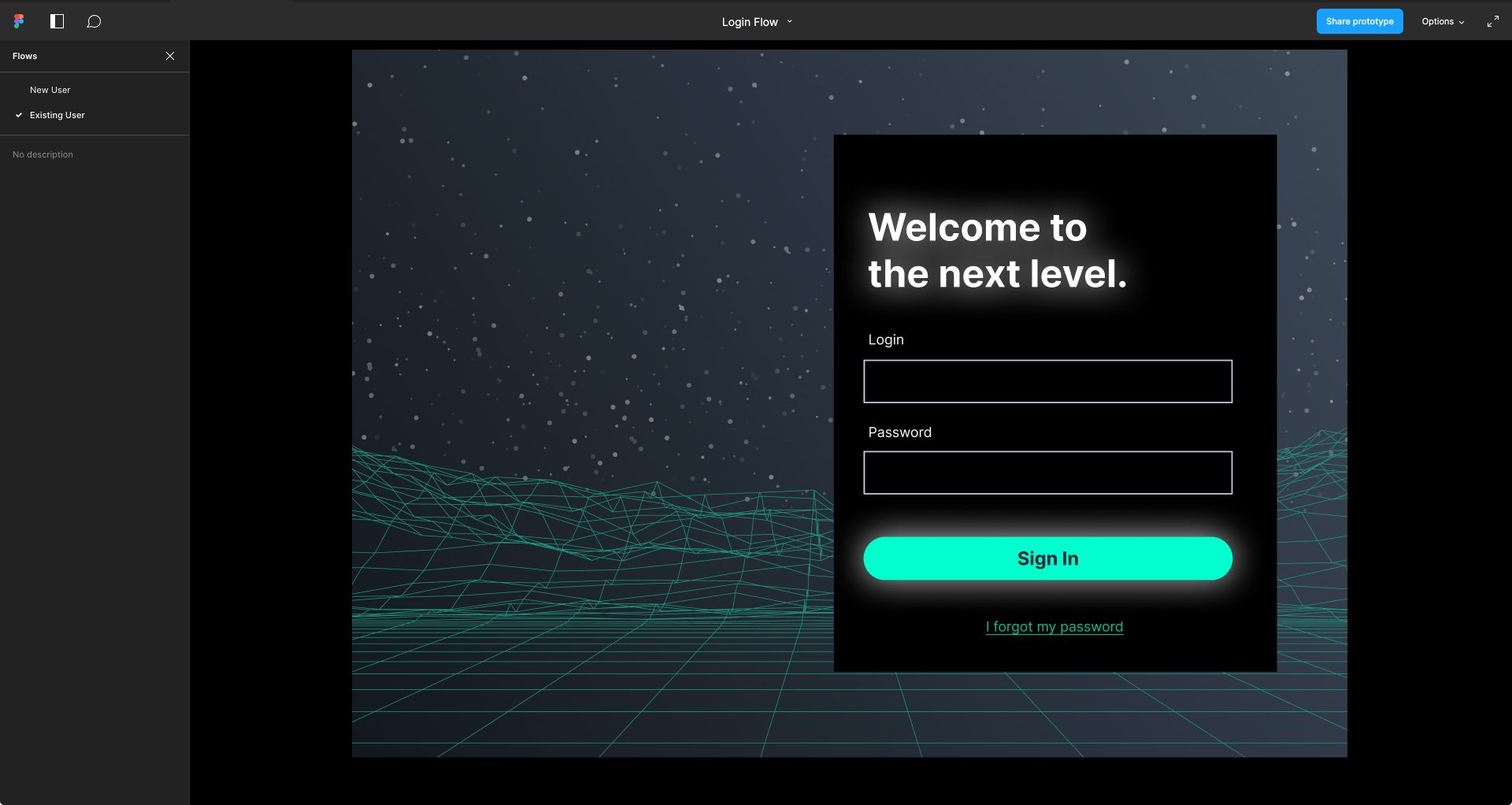
The prototype view has a dark background and shows one frame (or screen) at a time. Depending on the intent of the design, prototypes may have interactive, clickable areas, or they may be simply a collection of pages to navigate through.
Navigating in Canvas View
In the canvas view, you can scroll, pan with a trackpad, or hold the spacebar and click-drag. To zoom in and out, you can use the keyboard plus and minus keys. If you’re using a trackpad, you can also pinch-zoom.
Navigating in Prototype View
In the prototype view, you can use the arrow keys or click on the prototype, depending on how your designer built it. If you click on one spot on a prototype, but a hotspot has been created in another area on the page, it will flash light blue to indicate you should click here. Note that this feature can be disabled for user-testing.
Not all prototypes have hotspots, and some prototypes make use of auto-advance and other timed features. Certain quick prototypes may link an entire screen on click. Ask your designer if you're not clear on what kind of prototype they've built.
You can also click on the navigation at the bottom of the canvas (available on hover, if the setting is enabled). Restart takes you back to the first screen of a flow.
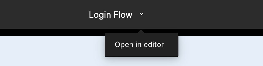
Depending on your permissions, you may be able to navigate between the prototype view and the canvas view. To switch to the canvas view from prototype view, click the file name and choose Open in Editor. To switch to the prototype view from the canvas, click the play button.
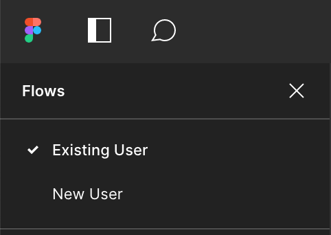
Typically, prototype links will have a list of flows (or static canvases) in the left side menu. If there are multiple flows, you can select which one you'd like to view from there.
Adding Comments
Commenting functionality is also available in both the canvas and prototype views, though it tends to be easier to leave a comment in the canvas view. To leave a comment, select the comment bubble and click on the relevant area. A location icon will appear. If you want to specifically notify someone of your comment, use the @ sign to trigger a dropdown list of users.
Interacting with the Canvas View
Left Side Panel
The left side panel contains the content of elements on the artboards. Individual artboards on the canvas are called frames. Frames can house a number of different elements, identifiable by their icon and specific properties.
Key to Common Icons
These icons appear in the left side panel and represent different objects on canvas.
A. Frame: a frame is a basic artboard in the canvas view. In order to appear in a prototype, an object must be placed in a frame. Frames can also be nested inside one another, and in that case, the parent frame will be considered the primary container.
B. Rectangle: basic shapes such as lines, circles, and triangles are represented in a similar way.
C. Bitmap image: a png or jpg image was placed on canvas.
D. Vertical auto layout: auto layout, Figma’s equivalent functionality for flexbox, has been applied to elements inside this container.
E. Horizontal auto layout: similar to previous, but moving in a left-to-right direction.
F. Group: indicates grouped content. Grouped content is a collection of elements with no particular automatic alignment or spacing behavior.
G. Main Component: indicates a specific grouping of elements that defines the appearance of child components.
H. Child Component: this is a copy of the main component. Edits made to the main component will be inherited here. Often, this indicates usage of design system components. Naming conventions (and usage communication with your designer) can help demystify component usage.
Object State Icons
The following icons indicate states of a particular object in the left side panel. An element can be locked and not available for direct selection on canvas. An element can also be hidden, or not visible on canvas.

Top-Level Navigation
Top-level navigation in the left-hand panel includes the following key items.

Layers: Elements are layered in frames and represented by vertical order in the left hand panel.
Frame: A frame can be expanded or collapsed in the left side panel. An expanded frame will show all elements contained within it in the panel.
Pages are individual canvases that typically hold distinct frames. Pages can’t interact with elements on another page. They can, however, be renamed to something more descriptive.
Right Side Panel
One of the best things about Figma is that it doesn’t require a third-party plugin or manual work to generate design specs. The functionality is built right into the app in the canvas view. Navigating the app takes practice, though.
The right side panel contains the Design, Prototype, and Inspect tabs.
The Design tab provides information about text styles and colors used on canvas objects.
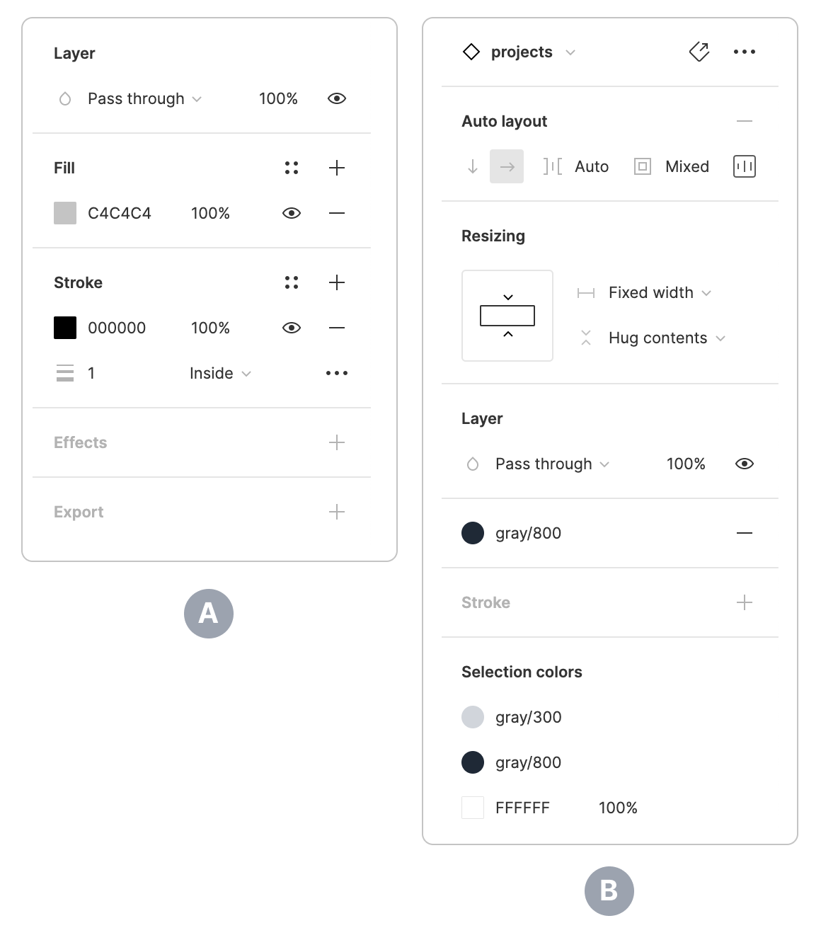
A. Selecting a drawn object will display raw properties and hex codes in the right side panel.
B. Selecting a component will display its icon and name and additional states and properties, depending on how the component was built. If an official color palette and text styles designated within Figma’s design system were specified within the component elements, named colors and styles will appear. If text style and color were not set properly, raw data will display.
Finding Design Specs
Figma allows direct selection and quick measuring on canvas. Assuming an object is unlocked, it can be selected with the arrow cursor. Pressing alt while an object is selected will show its distance in pixels relative to the edges of the canvas. Pressing alt and hovering over another object will show distance relative to that object.
Depending on your specific needs, raw positioning data and CSS can also be copied from Figma. Select an object on canvas, then navigate to the right hand panel and choose the Inspect tab.
Finding Motion Specs
Figma has rudimentary animation capabilities. Navigate to the Prototyping tab, then select the arrow between two frames to see if an animated transition has been specified and what the duration is.
Exporting Images
To export an image, select a frame, group, or object on canvas, then navigate to the Export section under the Design tab. Click the + and choose the preferred format and scale.
Takeaways
One of the best things about using Figma is that updates are available frequently and require no special permissions to enable. Over the last few months, Figma has introduced several new features, including Auto Layout, improved paste functionality, and the FigJam board.
Figma supercharges Roboflow's product design process. The real-time collaboration and developer-friendly features make it an essential part of our workflow, and we're excited to see how the product continues to evolve in the future.
Cite this Post
Use the following entry to cite this post in your research:
Rachel McClung. (Oct 7, 2021). Engineer's Guide to Figma. Roboflow Blog: https://blog.roboflow.com/the-engineers-guide-to-figma/