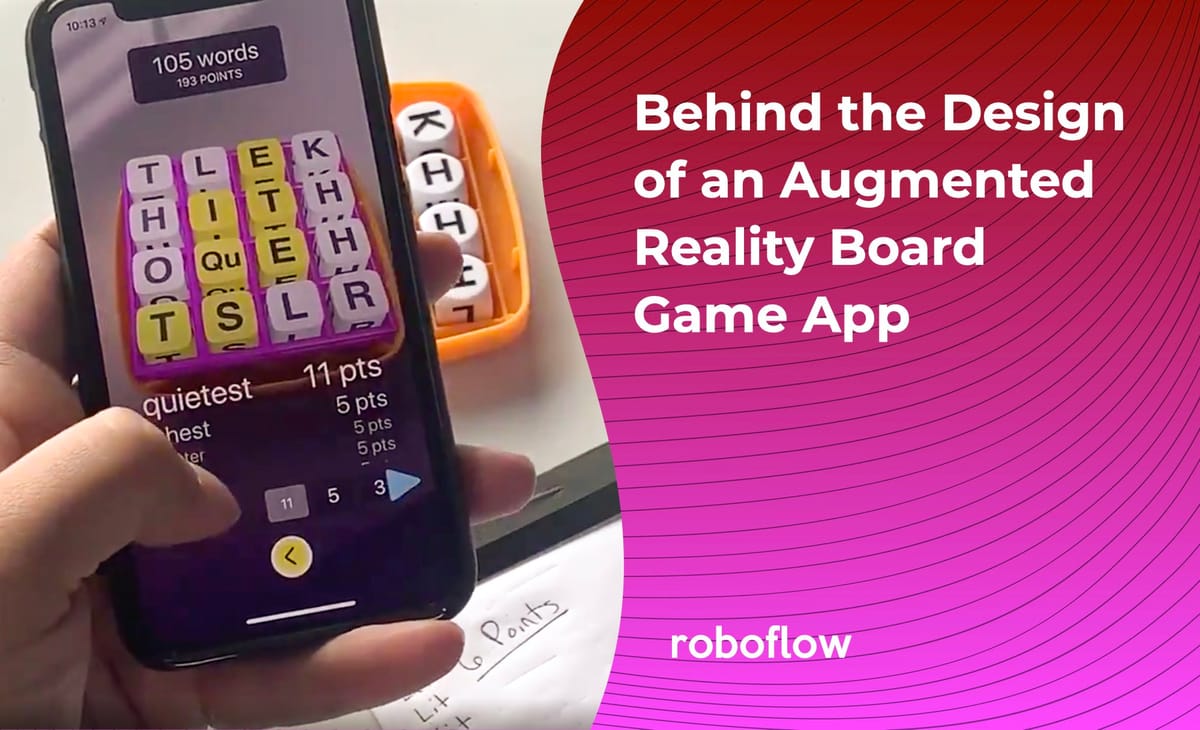
During the summer of 2019, I received a Facebook message from Roboflow co-founder Brad Dwyer asking me if I wanted to design a new mobile app he was working on. His previous app, Magic Sudoku, had recently generated some buzz online and even won a Golden Kitty award from Product Hunt, so he was excited to build another app using Apple's ARKit.
At the beginning of our meeting, Brad placed a Boggle box in front of me and said he wanted to experiment with augmented reality in the board game space. His vision was to blend the the experience of playing board games on your phone with the experience of playing a physical board game with friends.
Research
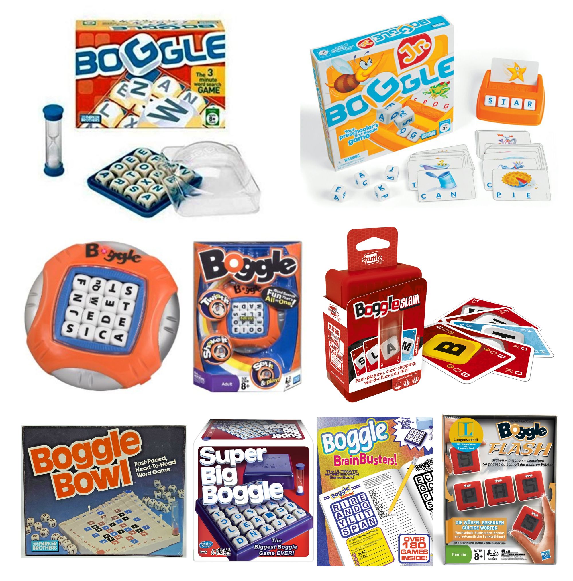
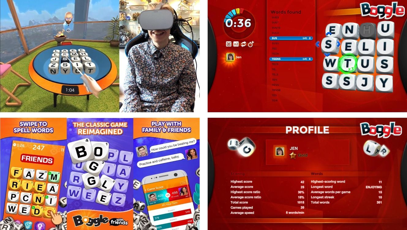
My first step was to buy Boggle and start playing it regularly. I also began researching different ways you can play Boggle, including all the variations sold by Hasbro, both physical and digital. I even watched old clips of a short-lived Boggle game show from the '90s on Youtube.
First Design Iteration - Where's the Augmented Reality?
I have designed many mobile apps over the years, but this was my first foray into augmented reality. From our initial research and our time spent playing the game, Brad and I identified some pretty obvious pain points.
- There’s no way quick way to identify words you’ve missed unless you type all the letters into an online Boggle solver.
- It takes a significant amount of time to read your words out loud and score them.
- It can be a pain to challenge words from other players if you aren’t familiar with the Boggle dictionary.
The main requirement was to use computer vision to scan the letters in the grid and provide a list of all possible words. I was still learning the capabilities of ARKit so, initially, I didn’t spend a lot of time designing the AR experience. I played it safe and designed a simple Boggle app that listed all the possible words, provided a 3-minute timer, and gave users the ability to enter their scores after each round.
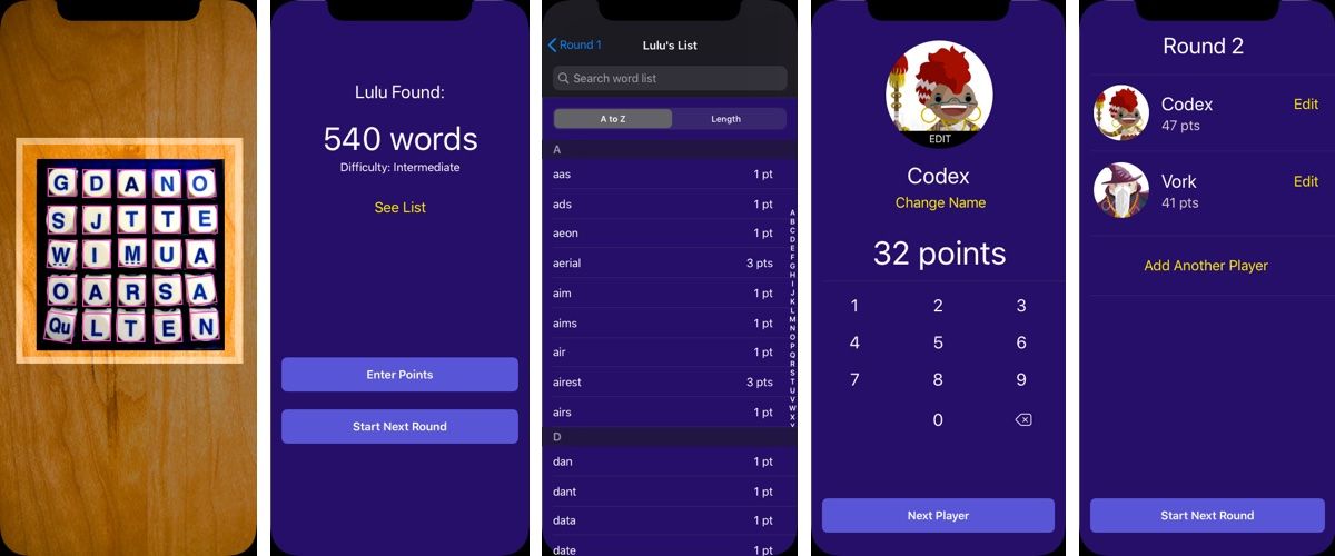
At this point, my designs were fulfilling Brad’s main requirement of including a computer vision component, but the app wasn’t really differentiating itself from other scorekeeping apps. Brad’s feedback was to go all in on the AR experience and come up with something he wasn’t even sure he could build.
Second Design Iteration - Let's Visualize Some Data
During my initial research, I found a great article full of tips for improving your Boggle score. It instructed players to look for common groups of letters and memorize all the various words that stem from those groups.
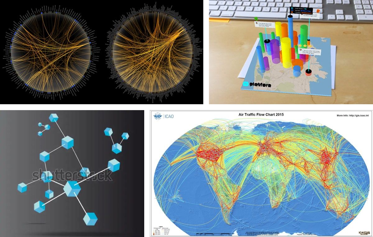
With AR, I realized we could use the letters on the grid to do more than just list out all the possible words. We could visualize how often letters are connected by words or draw attention to common groups of letters. I mocked up several concepts showing various ways we could visualize the letters identified in the grid.
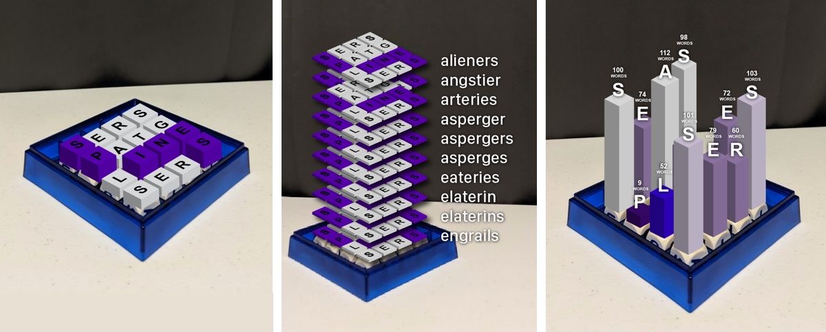

Third Design Iteration - Minimal Interface
We decided to take one of the 3D concepts and experiment with how we could render it in the app. Brad began building this in Reality Composer, while I mocked up screens for the rest of the user flow. We wanted to keep the interface as minimal as possible.
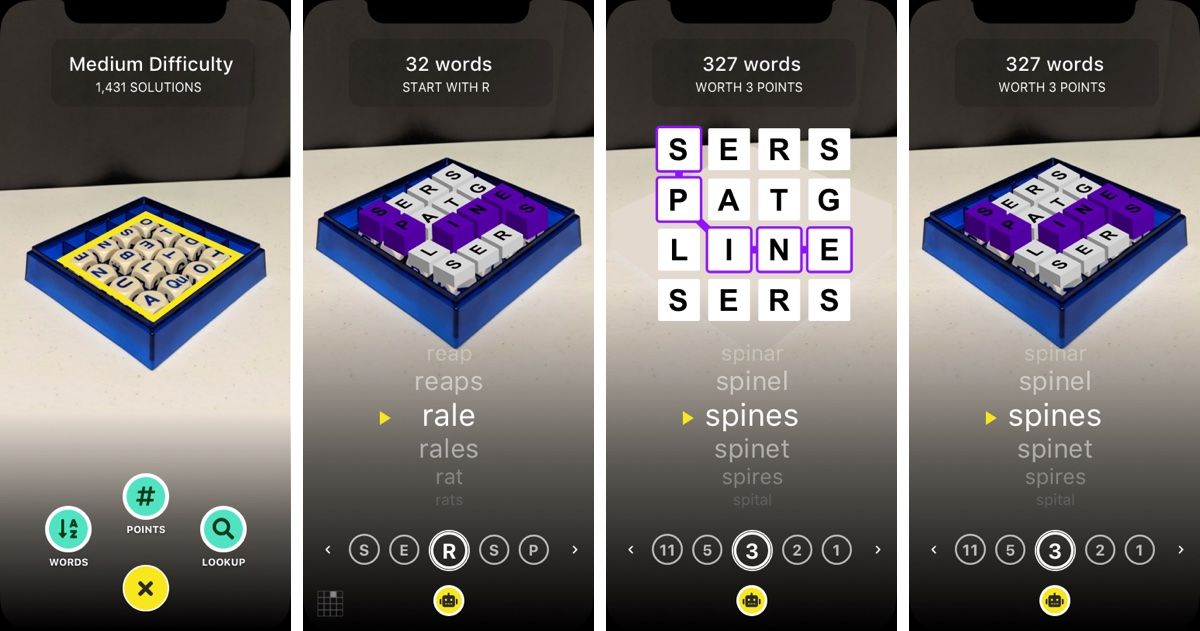
Refinement
When building interfaces for mobile apps, it’s typically a good idea to use SwiftUI's native interface elements as much as possible. This allows you to build faster and will cause less of a headache when it comes to long-term maintenance and device support.
How does SwiftUI affect my design process? Well, I rely more on a developer to explore what’s possible and we end making decisions as we go. For instance, can we customize the built-in picker or should we build our own?
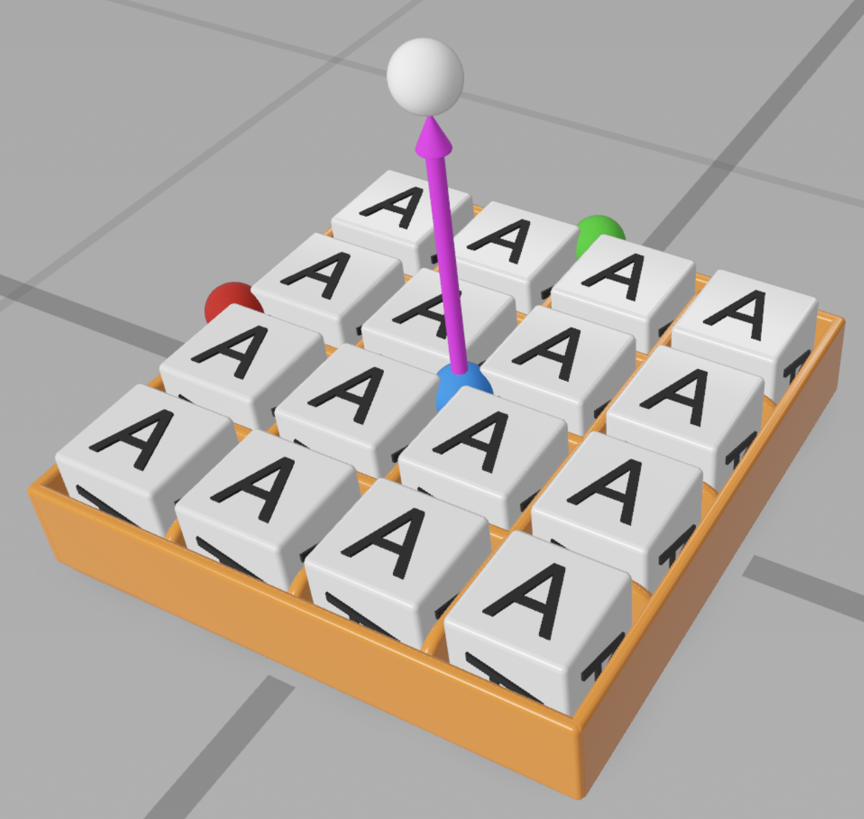
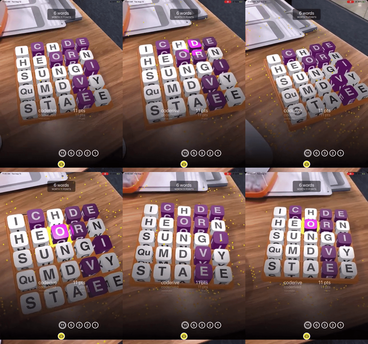
Animations were a great example of this. The app needed to do more than just show the user where the word was on the grid. We wanted to animate it for them. Brad provided various animation options and I was able to pick which ones would work best. This part of the project was a lot of fun because I never fully knew what Brad was going to come back with.

Testing, Testing, Testing
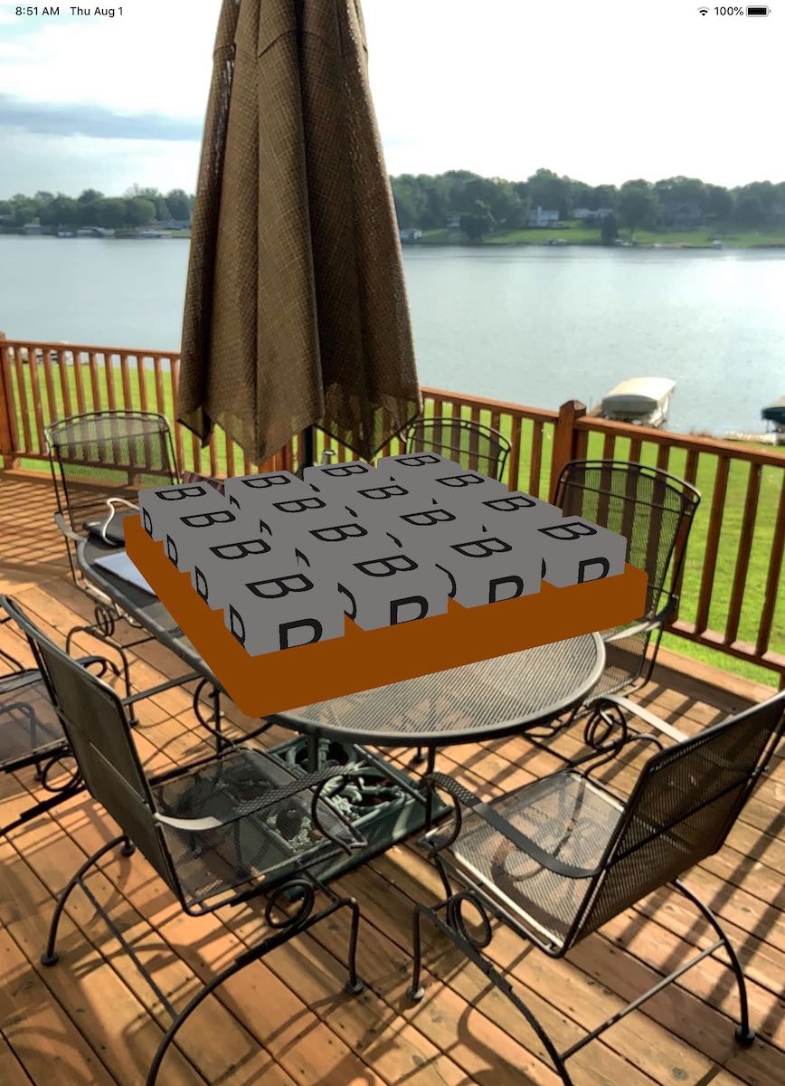
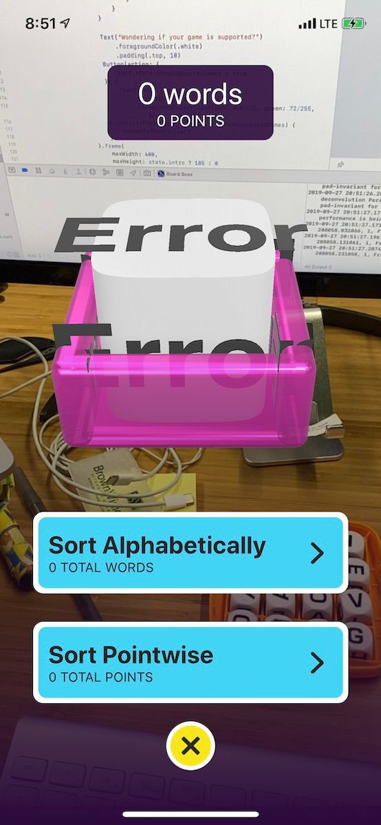
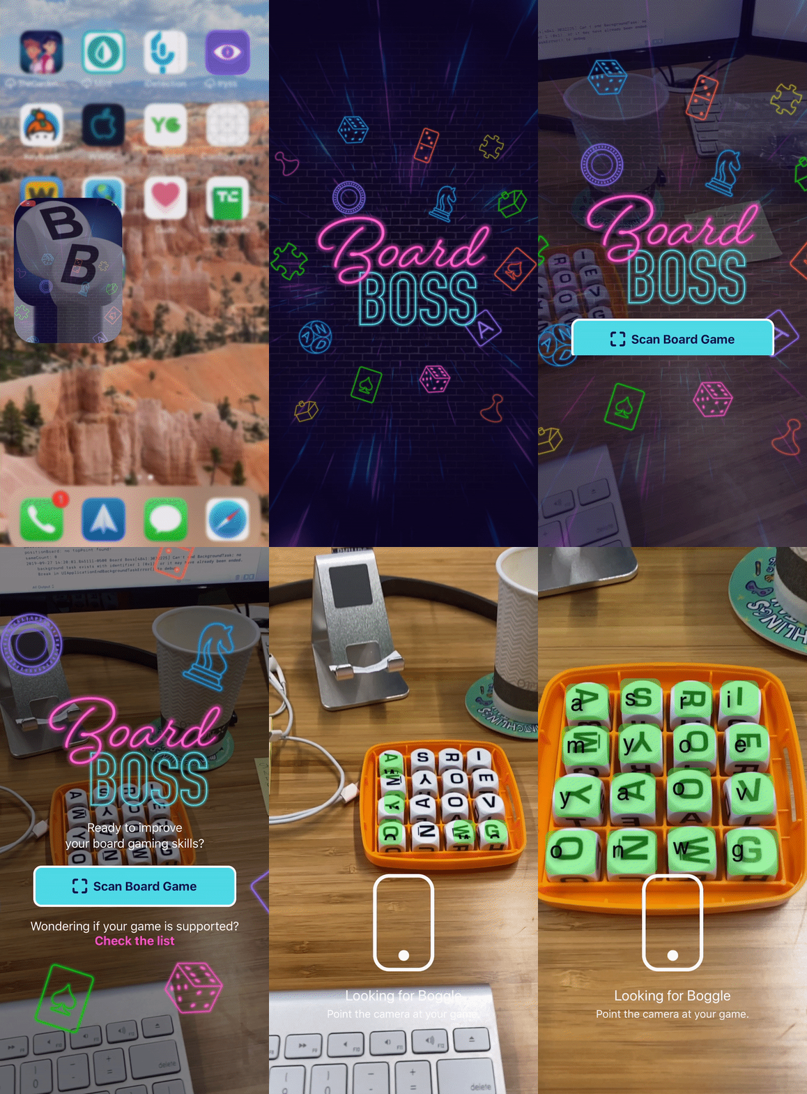
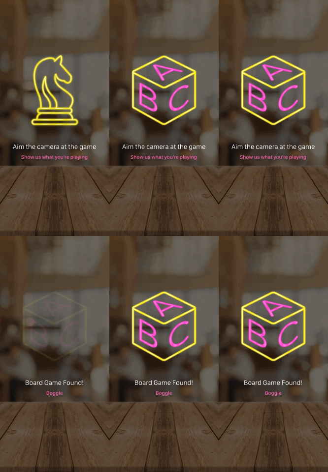
To be expected, locating the Boggle board was the most finicky interaction in the app. From table color to lighting and position, the environment can widely vary. We spent a lot of time testing in various conditions with different Boggle games and devices. Based on this, we adjusted the interface to provide guidance to users.
Branding
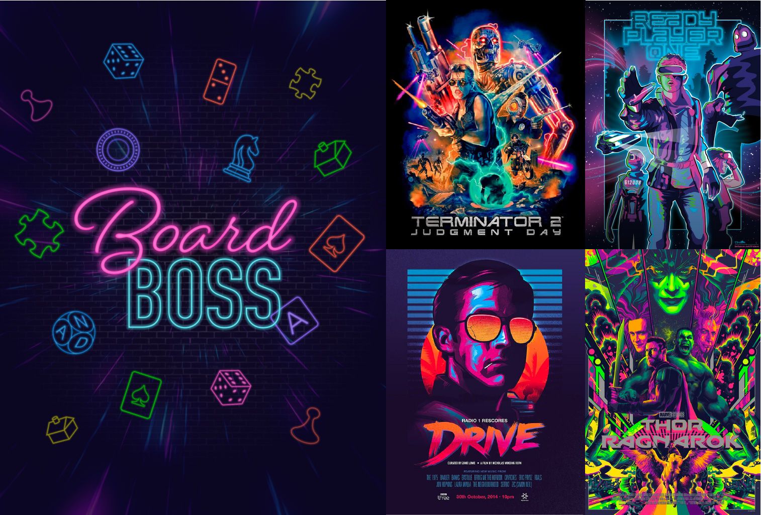
With a name like BoardBoss, the personality of the app needed to have some attitude. During my discovery phase, I noticed many augmented reality apps were using neon colors and dark backgrounds. These colors seemed to contrast nicely against busy backdrops, which is important when overlaying a camera view.
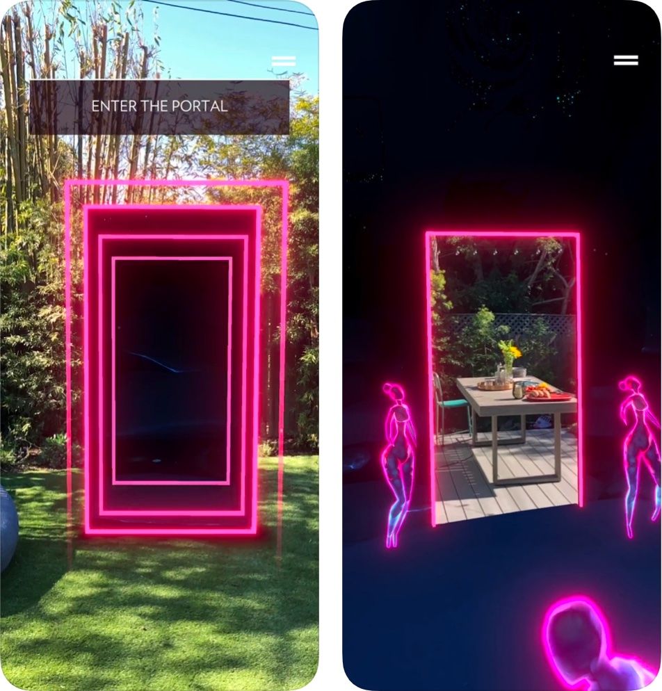
For the color palette, I drew inspiration from movie posters I found online that were direct callbacks to the '80s. The third season of Stranger Things had just been released so this aesthetic was popping up everywhere.
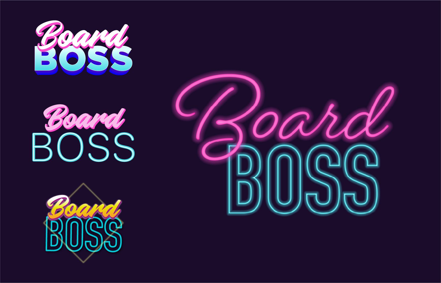
The logo and icons were styled to look like neon lights.
Launch
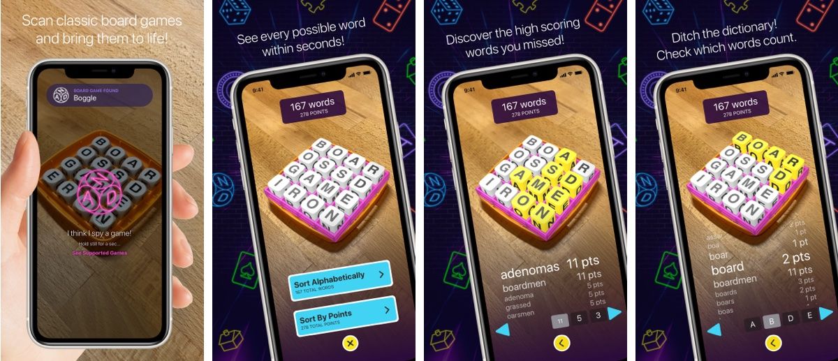
BoardBoss was launched in the App Store on October 8, 2019, and was immediately featured on Product Hunt.
Our new AR app brings the best features of board game apps to physical boardgames! https://t.co/TD7sov6LAj
— Brad Dwyer {🏗} (@braddwyer) October 7, 2019
The first game we support is Boggle. It shows the words everyone missed so you get better faster!
#arkit #madewitharkit #coreml #ai #ml #apple #iOS13 #games #tabletop pic.twitter.com/Ry038jbGpQ
A few months ago, someone asked me what I’ve worked on recently that I’m really proud of. Of course, I’m proud of everything we've built so far with Roboflow, but BoardBoss will always hold a special place in my heart.
BoardBoss allowed me to immerse myself in a new technology. I was able to conceptualize interfaces that I wasn’t sure we could build. We got to play around with 3D renderings, neon colors, and animation. And finally, it introduced me to the Roboflow team, whom I’ve had the pleasure of working with this past year.
Interested in duplicating the computer vision model we trained to make BoardBoss? Check out this post on the tech:

Cite this Post
Use the following entry to cite this post in your research:
Amanda Morrow. (Oct 26, 2020). Behind the Design of an Augmented Reality Board Game App. Roboflow Blog: https://blog.roboflow.com/designing-augmented-reality-computer-vision-apps/
