
Understanding training graphs is the difference between guessing and diagnosing a model's performance. These curves tell the story of your data: Is the model actually learning? Is it drawing tight boxes or just guessing? Is it confusing a shadow for a car?
In this guide, we’ll discuss the most common graphs, and show how the underlying metrics are computed for RF-DETR, Roboflow 3.0 models, and more. We’ll share how to read these graphs to diagnose training problems, compare models, and decide when training has converged.
Training Graphs in Roboflow
Computer Vision Training Graphs in Roboflow
After every epoch (one full pass over your dataset), your model is evaluated, and Roboflow plots these graphs. Here's how to read graphs for Roboflow 3.0 Object Detection, RF-DETR Object Detection, RF-DETR Segmentation, and YOLOv11.
1. The Model Performance Graph (mAP and mAP@50:95)
Roboflow surfaces the Mean Average Precision (mAP) as your primary health indicator. It’s the visual representation of your model "finding its eyes" - moving from random guesses to surgical precision.
During the early stages of training, the model has not yet learned what the objects look like. It makes random guesses and places bounding boxes in incorrect regions of the image. As training continues, the model slowly learns visual patterns from the data. This learning process is reflected in the upward movement of the curve. When the curve becomes flat, it usually means that the model has learned most of what it can from the given dataset, and further training will only provide small improvements.
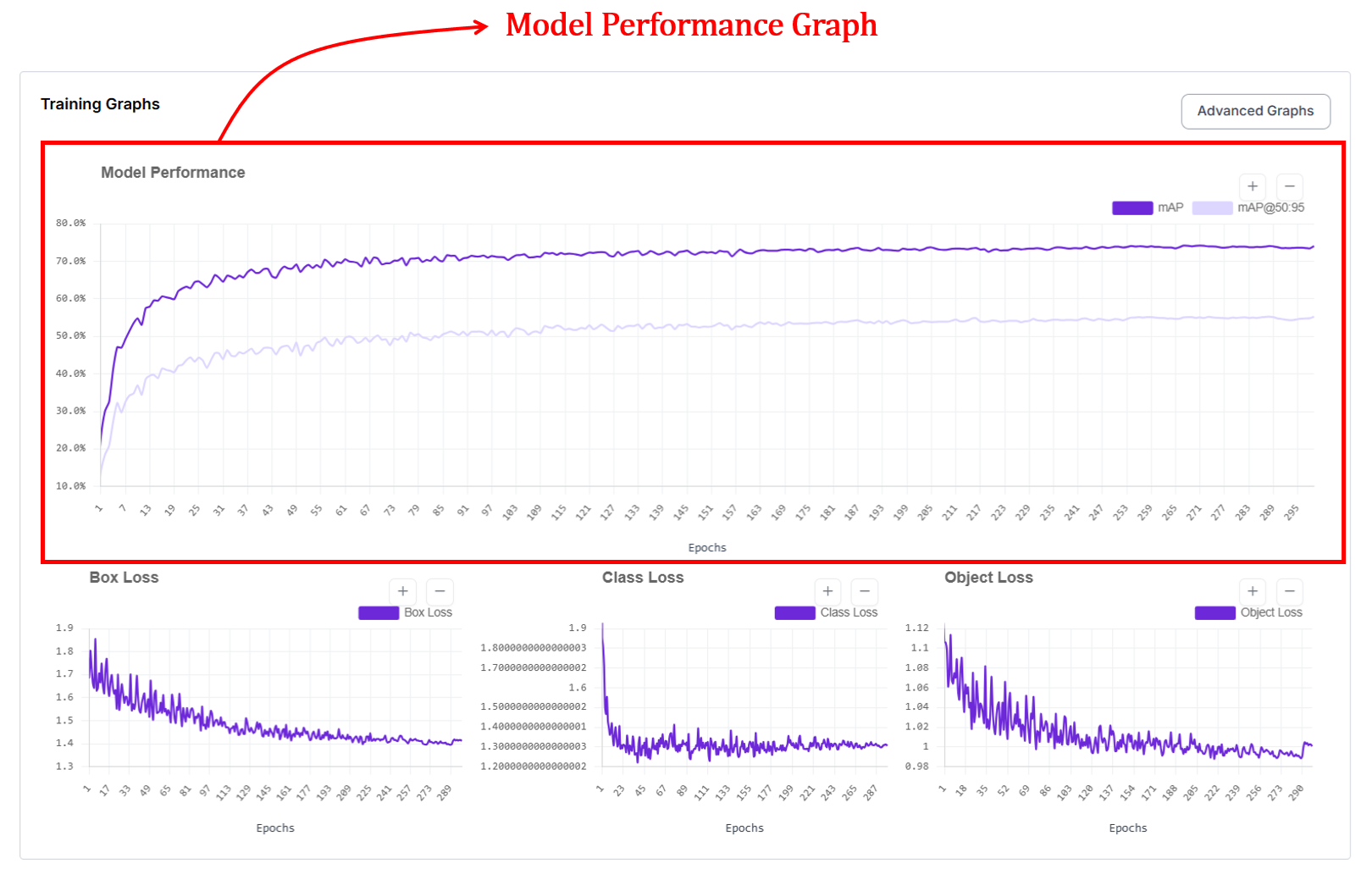
Reading the Curves
In the Roboflow graph UI, you’ll typically see two distinct lines climbing upward. They represent two different "difficulty settings" for your model:
- mAP@.50: This measures how well your model finds objects with at least a 50% overlap (IoU). It’s your baseline for "did I find it?"
- mAP@.50:.95: This is a much stricter metric. It averages performance across a range of overlap thresholds, essentially grading the model on how perfectly the box (or mask) hugs the object. This curve will always be lower because it’s much harder for a model to be pixel-perfect than "roughly correct."
How are mAP and mAP@50:95 calculated and plotted?
Every time the model finishes a pass over your data (an epoch), the model is evaluated on a validation set. For object detection, predictions are matched to ground-truth objects using bounding-box IoU at one or more thresholds (e.g., 0.50 for mAP@50, and 0.50–0.95 for mAP@50:95). Precision and recall are computed per class from these matches, the area under each class’s precision-recall curve gives Average Precision (AP), and AP is averaged across classes to obtain mAP. For instance segmentation, the same evaluation procedure is applied using mask IoU between predicted and ground-truth masks to compute mask AP (mask mAP), which measures how accurately the predicted shapes match the true object masks.
2. Box Loss Graph (Bounding Box Loss)
The box loss graph is another important graph provided for models like YOLOv11 and Roboflow 3.0 models in Roboflow. If mAP is your model’s "grade," box loss is its "form."
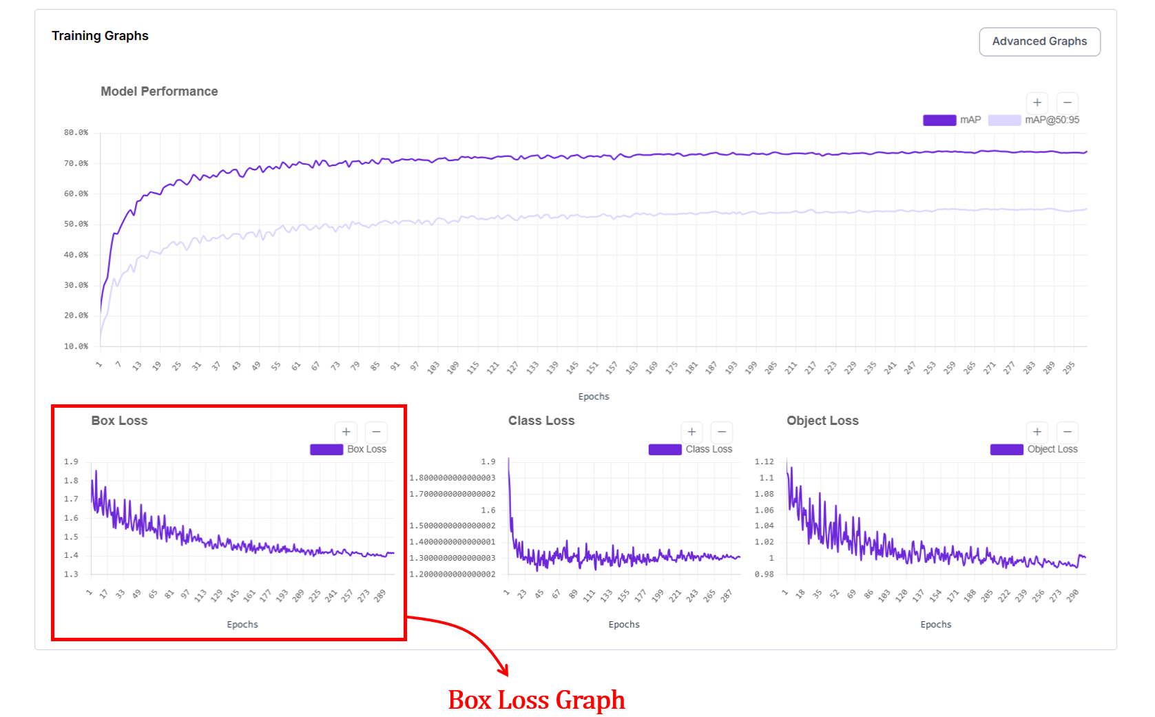
In the Roboflow UI, this graph tracks the localization error, essentially answering the question: "How precisely is the model drawing its boundaries?". The x axis represents the epochs and y axis represents loss value.
On this graph, lower is better. You want to see a steep dive in the early epochs followed by a smooth, stable floor.
At the start of training, box loss is high because the model places boxes in wrong locations or with incorrect sizes. As it progresses, box loss decreases, showing that predicted boxes are getting closer to the ground truth. When the curve flattens, it usually means the model has learned most of the spatial structure it can from the data.
How does box loss work?
When a detection model makes a prediction, it draws a bounding box on the image. The training system compares this predicted box against the correct box from the dataset. Box loss is a single number measuring how wrong that prediction is. The worse the box, the bigger the number. During training, the model reduces this number by drawing progressively better boxes.
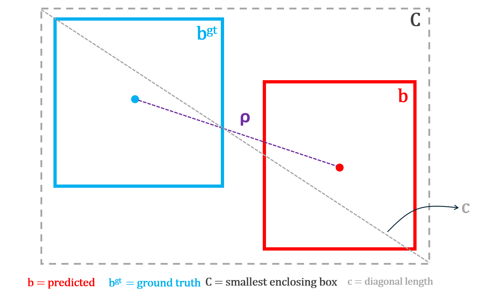
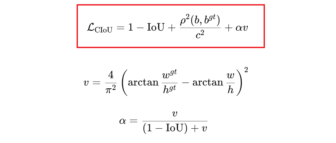
The challenge is how you measure "wrong." A box can be wrong in multiple ways, such as, it might not overlap the object, its center might be off, or its proportions might be completely different even if it's in the right place. Researchers developed a series of loss functions (IoU, GIoU, DIoU, and CIoU) each one fixing a blind spot that the previous version had. Think of them as progressively smarter rulers for measuring box quality.
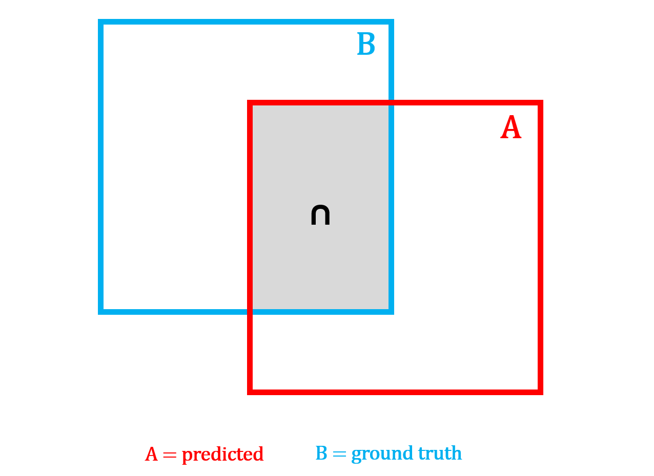
IoU Loss: Answers the question: "Do the boxes overlap?" If the two boxes overlap a lot, the loss is small. If they barely overlap or do not overlap at all, the loss is large.
This teaches the model to place boxes on top of the actual object instead of the nearby background. However, when the boxes do not overlap at all, IoU gives no gradient signal, the loss stays flat no matter how far apart the boxes are, giving the model no indication of which direction to move.
IoU loss can be computed using the following formula:

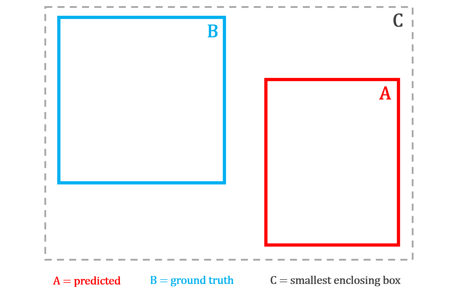
GIoU Loss: GIoU loss improves on IoU loss by still giving useful feedback even when the predicted box and the correct box do not overlap at all. It finds the smallest box that encloses both A and B, then penalizes how much of that enclosing box is wasted, meaning the space inside it that is not covered by either box.
The larger this wasted area is relative to the enclosing box, the bigger the penalty. This ensures the model always receives a gradient signal pushing it in the right direction, even when it is completely off target.
GIoU loss can be computed using the following formula:

DIoU Loss: DIoU loss improves on GIoU by taking a more direct approach - trying to "move the box toward the object's center." Instead of penalizing wasted area, it directly measures the distance between the center point of the predicted box and the center point of the correct box, normalized by the diagonal of the enclosing box.
This gives the model an explicit signal to move its center toward the true center, which is faster and more precise than GIoU's indirect area-based penalty. However, DIoU still does not care about shape (width, height). Two boxes with perfectly aligned centers but completely different proportions receive no additional penalty.
DIoU loss can be computed using the following formula:

CIoU Loss: This matches position and shape. CIoU loss goes one step further by combining all three geometric properties into a single loss. It penalizes poor overlap, large center distance, and aspect ratio mismatch between the predicted and true box simultaneously. The aspect ratio penalty is weighted by a dynamic factor that stays small early in training when the box is far off, and grows larger as the box gets closer, so shape refinement only kicks in once the box is roughly in the right place. This encourages the model to draw boxes that are not only in the right position but also have the correct proportions.
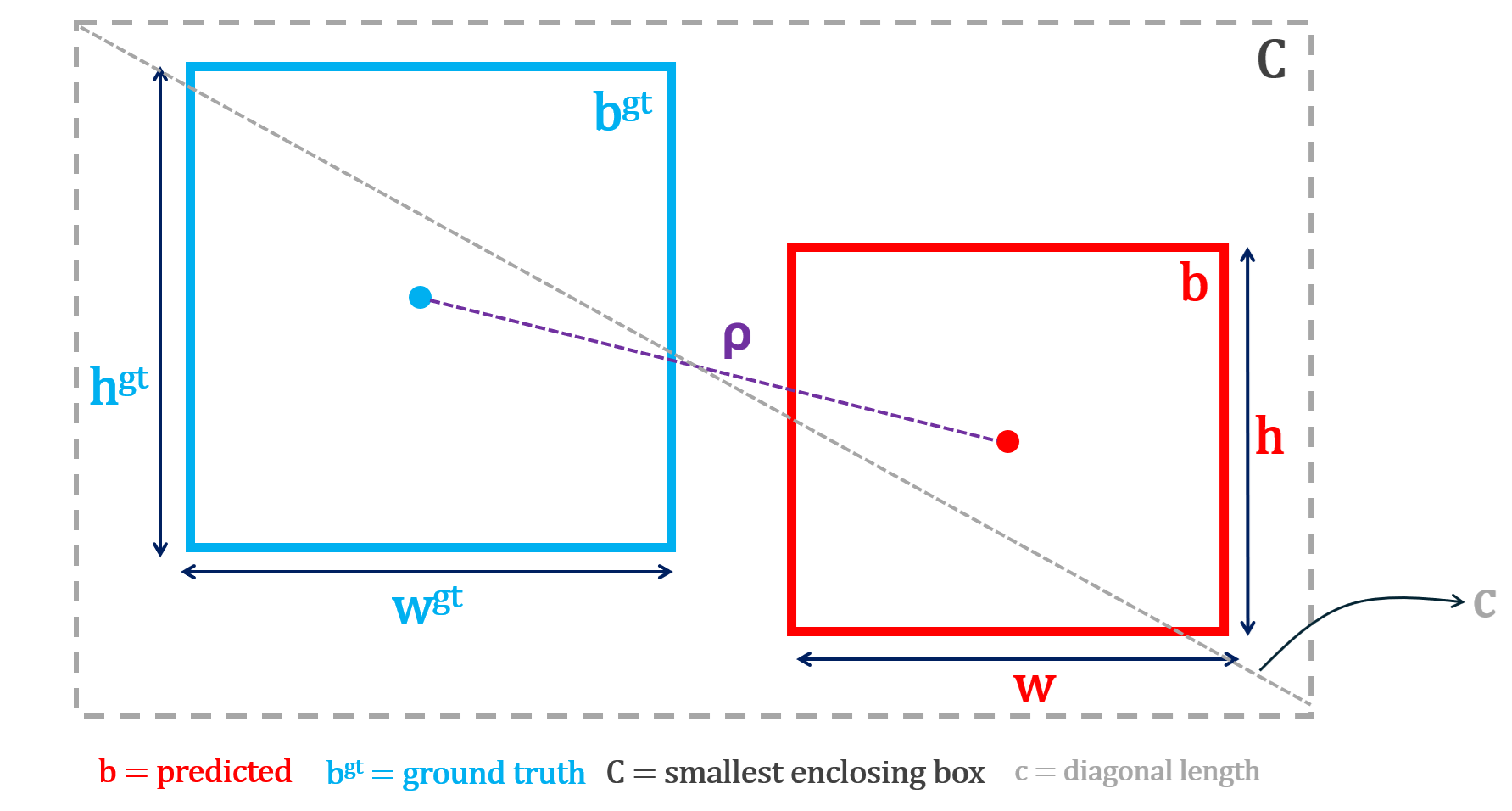
CIoU loss can be computed using following formula:
L1 Loss: L1 Loss is primarily used for bounding box regression. It is one of the simplest ways to measure how wrong a prediction is. It answers the question “How far off am I, in absolute terms?”.
No squaring, no complex geometry, just distance on the number line. In other words, L1 loss measures the absolute difference between the true value and the predicted value. It is mathematically represented with the formula (vector form, e.g., for a bounding box):

where x=[x1, x2, x3, x4] is the true vector and y=[y1, y2, y3, y4] is the predicted vector. A vector just means a group of numbers that belong together.
In object detection, a bounding box is not one number. It is a set of four numbers, for example: [x, y, w, h]
- x is horizontal position
- y is vertical position
- w is width
- h is height
So:
- x=[x1, x2, x3, x4] is the true box
- y=[y1, y2, y3, y4] is the predicted box
The vector L1 loss adds the absolute error of each coordinate. This forces the model to improve:
- left-right position
- up-down position
- width
- height
all at the same time.
How is box loss computed?
After each training iteration, the model predicts a bounding box for each detected object. These predicted boxes are matched to ground-truth boxes, and a loss function measures how different each predicted box is from its matched ground-truth box. The worse the prediction, the higher the loss.
YOLO models typically use CIoU loss, which penalizes poor overlap, center distance, and aspect ratio mismatch simultaneously. RF-DETR models use a combination of L1 loss (absolute difference between predicted and true box coordinates) and GIoU loss (penalizing poor geometric overlap). The loss is averaged across all matched boxes in each training batch, and the average loss per epoch is recorded and plotted. A steadily decreasing curve means the model is learning to draw tighter, more accurate bounding boxes.
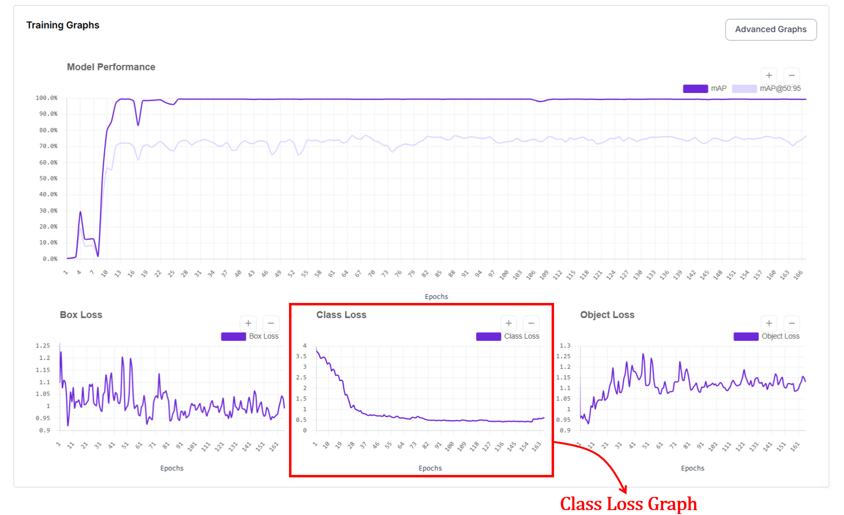
3. Class Loss Graph
The class loss graph shows how well the model learns to assign the correct label to each detected object. In short, did the model name the object correctly? High loss means the model mixes up classes, such as calling cars bikes. Low loss means the model reliably labels objects as their true category.
The x axis represents the epochs and y axis represents loss value. At the start of training, class loss is high because the model confuses categories. As training progresses, class loss drops quickly as the model learns visual differences between classes. When the curve becomes stable, it indicates that the model has learned most of the class distinctions present in the data.
How is class loss computed?
In object detection, class loss trains the model to predict what category each detected object belongs to. For every predicted box that is matched to a ground-truth object, the model outputs a set of class scores or probabilities. Class loss measures how different these predicted scores are from the true class label.
If the model assigns low probability to the correct class (for example, predicting “cat” when the object is a “dog”), the class loss is high. If it assigns high probability to the correct class, the class loss is low. During training, the model updates its weights to increase the probability of the correct class for each matched box.
In segmentation models, class loss works the same way. Each prediction still corresponds to an object with a class label. The difference is that the prediction also includes a mask in addition to a box. The model must correctly identify what the object is regardless of whether the task is detection or segmentation, so the same class loss functions apply.
In practice, datasets contain many easy examples and fewer hard examples such as small, rare, or partially occluded objects. Standard classification losses can be dominated by easy negatives in dense detection settings. To address this, modern detectors use different class loss functions (for example, Binary Cross-Entropy or Focal Loss) depending on the framework, to balance learning between easy and hard examples and to handle class imbalance in large-scale datasets.
4. Object Loss Graph (Objectness / Confidence Loss)
For object detection, you'll also see the object loss graph, which shows how well the model learns to decide whether an object is present (is something there at all?) at a given location. The x axis represents the epochs and y axis represents loss value.
At the start of training, object loss is high because the model either predicts objects where none exist or misses real objects. As training progresses, object loss decreases and stabilizes as the model learns to distinguish between background and true objects.
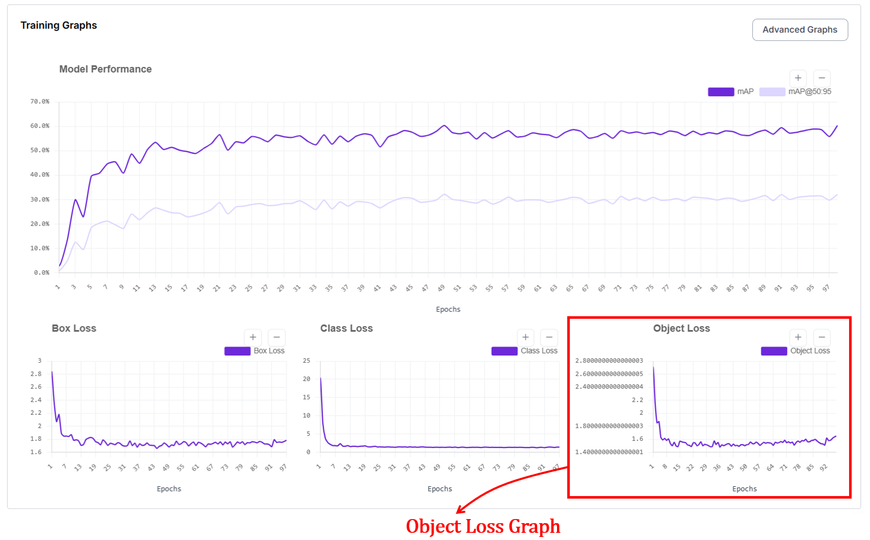
How does object loss work?
Object loss works by comparing the model’s predicted objectness (confidence) score with a binary ground-truth label that indicates whether an object is actually present at that location. For each predicted box or region, the target is set to 1 if it overlaps a real object and 0 if it corresponds to background. The model outputs a probability between 0 and 1, and the loss penalizes confident mistakes.
Predicting a high score for background increases the loss (false positive), and predicting a low score for a true object also increases the loss (missed detection). During training, this feedback pushes the model to raise confidence only where objects truly exist and suppress confidence everywhere else. There are different loss functions for computing object loss. Binary Cross-Entropy (BCE) is one of those functions.
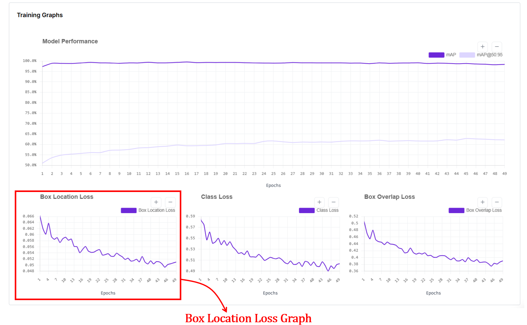
5. Box Location Loss
When you train an RF-DETR object detection or segmentation model, you'll also see a box location loss graph. In RF-DETR, box location loss measures how far the predicted box coordinates are from the ground-truth box coordinates. The x-axis of the graph shows training epochs, and the y-axis shows the average coordinate error (lower is better).
Internally, RF-DETR first matches each prediction to a ground-truth box using Hungarian matching, then computes an L1 loss between the predicted and true box parameters (cx, cy, w, h), which are normalized by image size. This L1 error is averaged over all matched boxes and plotted per epoch. As training progresses, this loss drops because predicted box positions and sizes get closer to the true boxes, and it flattens when the model has largely learned the object geometry from the data.
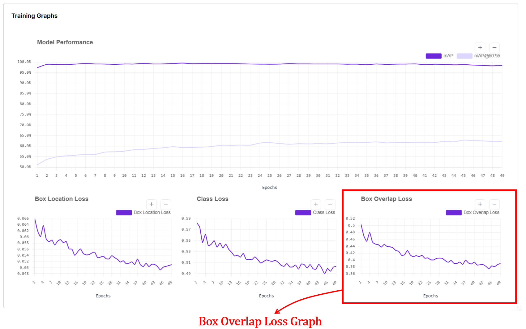
6. Box Overlap Loss Graph
Box overlap loss measures how well the predicted bounding boxes geometrically overlap with the ground-truth boxes for RF-DETR object detection models. In the box overlap loss graph, the x-axis shows training epochs, and the y-axis shows the average overlap error (lower is better).
Internally, after matching predictions to ground-truth boxes using Hungarian matching, RF-DETR computes an IoU-based loss (typically Generalized IoU, GIoU) between each predicted box and its matched ground-truth box, then averages this value over all matched boxes for each epoch. This loss goes down as predicted boxes better cover the true object regions and align more tightly with object boundaries, and it flattens once overlap quality has largely converged.
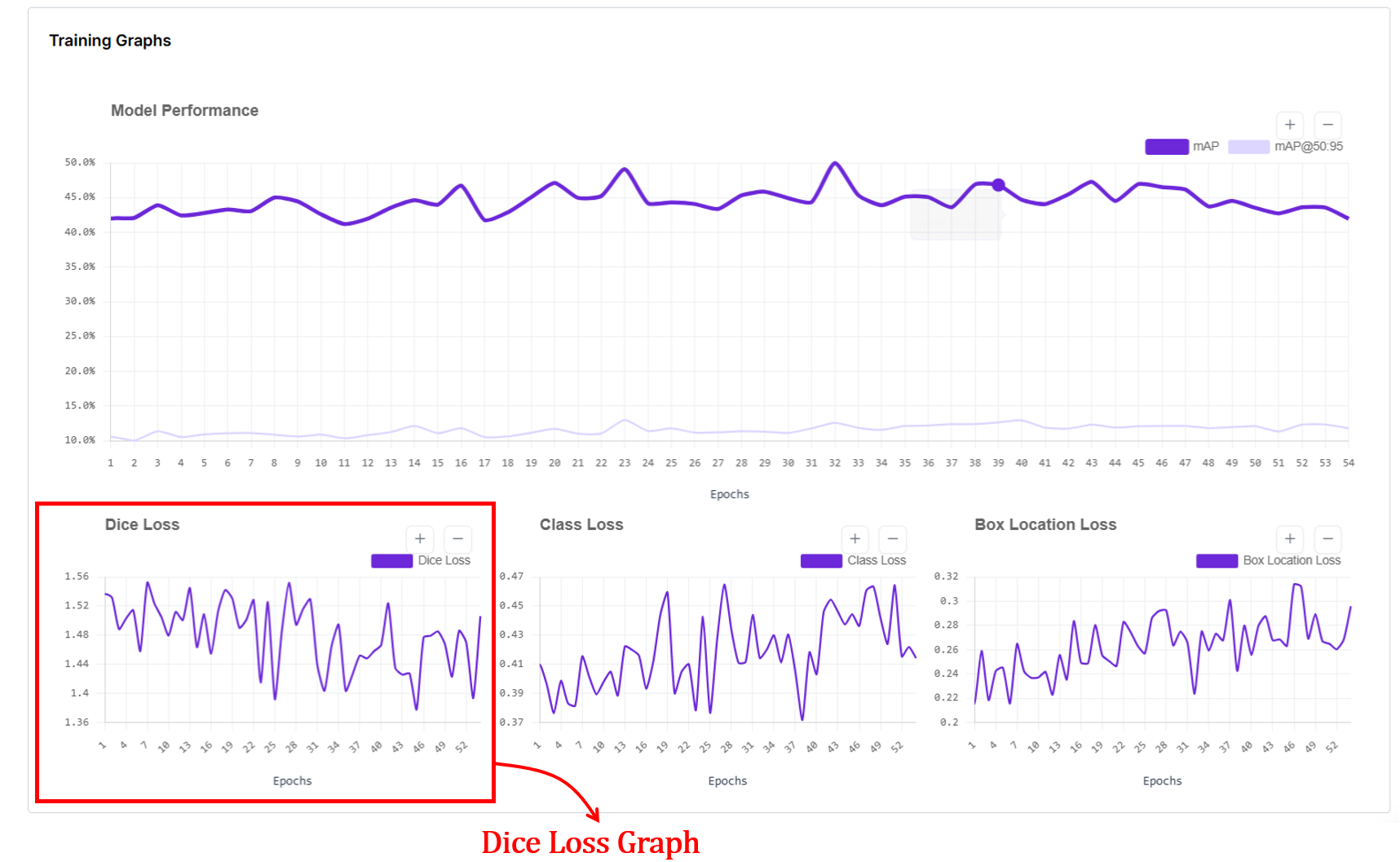
7. Dice Loss Graph
The dice loss graph in RF-DETR segmentation training shows how well the predicted object masks overlap with the ground-truth masks over training epochs. The x-axis represents epochs, and the y-axis shows the dice loss value, where lower is better.
In RF-DETR, segmentation follows the DETR-style training pipeline: predictions are first matched to ground-truth objects using Hungarian matching, and a mask loss is computed for each matched pair and averaged per epoch.
This loss measures pixel-level overlap between predicted masks and ground-truth masks, so a decreasing Dice loss indicates improving mask alignment and shape quality. When the curve becomes flat or noisy without a downward trend, it suggests mask quality is no longer improving significantly, which can reflect limited data, annotation noise, or that the model has largely converged for mask learning.
Advanced Training Graphs in Roboflow
For high-performance models like YOLO11, Roboflow provides a detailed dashboard that separates training performance from validation reality. While simple graphs give you the "what," these advanced plots explain the "why." They are your best defense against overfitting.
Training metrics are computed on images the model has already seen and learned from during the current epoch. Validation metrics are computed on a separate held out set of images that the model never trains on. This separation is important because a model can memorize training data without truly learning. When both training and validation curves improve together, the model is genuinely learning patterns that transfer to new images. When training metrics improve but validation metrics stall or worsen, the model is overfitting. It is memorizing the training set rather than learning general visual patterns.
The x-axis in every plot shows the number of training epochs. Each point corresponds to the model after one full pass over the training dataset. The y-axis shows the value of the specific metric being tracked:
- For loss plots (box_loss, cls_loss, dfl_loss), the y-axis is the average loss value. Lower is better.
- For metric plots (precision, recall, mAP50, mAP50-95), the y-axis is a score between 0 and 1. Higher is better.
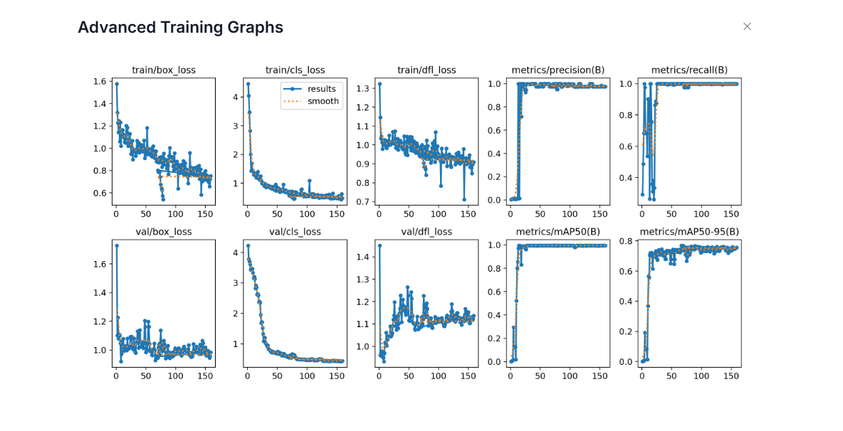
- train/box_loss: This shows how well the model learns to localize objects on the training images. The downward trend means the model is learning to place boxes more accurately on images it has already seen.
- val/box_loss: This shows localization error on unseen validation images. When this follows the training curve downward, the model is generalizing well. If training loss goes down but validation loss goes up, it suggests overfitting.
- train/cls_loss: This shows how quickly the model learns to assign the correct class labels on the training set. The sharp early drop means the model quickly learns basic class differences.
- val/cls_loss: This shows class confusion on validation images. A similar downward trend indicates the model’s class understanding transfers to new data. If it stays high, labels may be noisy or classes visually overlap.
- train/dfl_loss: DFL (Distribution Focal Loss) is a box regression loss that changes how the model predicts bounding box edges. Instead of predicting each box coordinate as a single number, the model predicts a probability distribution over discrete bins. It then uses cross-entropy loss to optimize these distributions so that the probability concentrates around the correct coordinate value. The final box coordinate is recovered as a weighted average over all bins, which allows sub-pixel precision and lets the model express uncertainty at ambiguous object boundaries caused by occlusion, blur, or shadows. A slow, steady decrease in DFL loss indicates the model is learning to produce sharper, more confident distributions around the true box edges.
- val/dfl_loss: This shows whether the model's precise box edge predictions generalize to unseen validation images. Some noise is normal since validation images contain object boundaries the model has never seen. A stable or slowly decreasing curve is healthy. If val/dfl_loss starts rising while train/dfl_loss keeps falling, it suggests the model is memorizing training box edges rather than learning generalizable boundary patterns.
- metrics/precision(B): Precision answers: When the model predicts an object, how often is it correct? The quick rise to near 1.0 means the model quickly learns to avoid false positives.
- metrics/recall(B): Recall answers: Of all real objects, how many does the model find? The early instability reflects the model initially missing many objects. As training progresses, recall rises, meaning fewer misses.
- metrics/mAP50(B): This is detection accuracy at IoU = 0.5 on the validation set. The fast rise means the model quickly learns to find objects roughly correctly.
- metrics/mAP50-95(B): This is stricter accuracy across IoU thresholds 0.50–0.95. The slower, steadier rise reflects gradual improvement in tight localization. This metric is harder to improve, and is a better indicator of overall detection quality.
When training losses go down, validation losses also go down, and precision/recall/mAP go up and stabilize, the model is learning well and generalizing to new images. Divergence between training and validation curves signals overfitting. High precision with low recall means the model is conservative and high recall with low precision means it produces many false alarms. Together, these graphs give a complete picture of how well the detector is learning to find, name, and tightly localize objects.
How to Use Computer Vision Training Graphs
Roboflow gives you these metrics so you diagnose exactly what's happening. Here is how to use these signals to build a better model:
- Diagnose the "Fit": Graphs are your primary defense against overfitting (great on training, bad on validation) and underfitting (bad on both). If the two lines are drifting apart, your model is memorizing, not learning.
- Master Early Stopping: Don't waste money and time. When your validation mAP flattens out and your loss stops dropping, hit the brakes.
- Hyperparameter Tuning: See a massive spike in loss? Your learning rate might be too high. Is the curve barely moving after 50 epochs? It might be too low. The graph tells you if your settings are "just right" or if you're fighting against your own configuration.
- Specific Error Diagnosis: Each curve is a specialist.
- High Box Loss? You need better localization or more precise bounding boxes.
- High Class Loss? Your classes might look too similar, or your labels are messy.
- High Objectness Loss? Your model can't tell the difference between your product and the background.
- Audit Your Data Quality: If your curves look like a jagged mountain range (noisy and unstable), your data is likely the culprit. Look for class imbalances, missing annotations, or contradictory labels that are confusing the model.
- Run Better Experiments: Use the graphs to settle the debate between "Dataset A" and "Dataset B." By overlaying these metrics, you can see which version converges faster and reaches a higher peak of accuracy.
Computer Vision Training Graphs Conclusion
Roboflow’s interface is designed to provide a clear, observable roadmap. We’ve built these model training visualizations to ensure you spend less time squinting at terminal outputs and more time making high-impact engineering decisions. By providing a unified view of your model’s vitals, we hope this guide helps you build with confidence.
Cite this Post
Use the following entry to cite this post in your research:
Timothy M. (Feb 23, 2026). Roboflow Training Graphs Guide. Roboflow Blog: https://blog.roboflow.com/roboflow-training-graphs/